01 · Problem
PC-first MVP had to ship on mobile, tablet, and console simultaneously, without tripling design and engineering cost.
 UbisoftUser researchAccessibility DesignPhysical Experiences
Releasing a new learning game on 5 unique platforms with 1 design system. Unifying interactions and UI with technical cohesion and a strong design philosophy.
PC-first MVP had to ship on mobile, tablet, and console simultaneously, without tripling design and engineering cost.
Developing a robust set of components, interactions, and underlying technology to support 5 platforms with 1 design system
Intense research to retain focus on most important user needs to keep all teams aligned

Scroll for the full case study ↓
I joined the team in 2020 when Rocksmith+ was in pre-launch production and Ubisoft wanted a global release on mobile, PC, and next-gen game consoles (PlayStation 5 and Xbox Series X). Very few people on the UX team had prior experience building mobile user experiences and responsive UIs and interactions for multiple platforms.
The MVP for Rocksmith+ was also built only for PC. My goal was to deliver it on Mobile and Tablets in addition to Consoles to invite a whole new audience of guitar learners from around the globe.
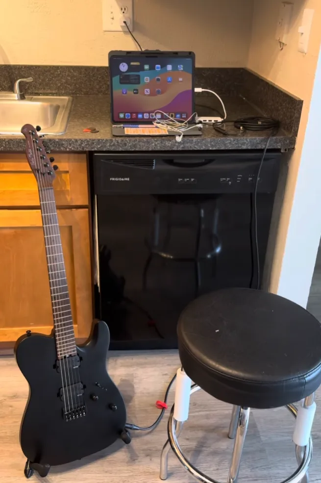
The first piece of work started with extensive user testing. I requested internal and external volunteers to play a crude, ported version of the PC game on iPad without any scaling and no interactions except simple taps. My first few initial tests were to discover how people set up a portable device compared to playing on a PC or a TV to understand the context and environment in which Rocksmith+ would be experienced.
The tests gleaned insights using three primary methods:
Throughout virtual and in-person testing sessions I made notes of various environments users learn guitar in:
Another important highlight was the amount of personalisation needed:
Wanted a hassle-free and wireless experience.
Wanted a hardcore experience with all their gear. 77% of these were legacy Rocksmith users.
We also included questions related to eyesight. I wanted to know how many users suffered from eyesight issues including near/far sightedness and colour vision deficiency. I personally suffer from near sightedness and colour vision deficiency which impassioned my desire for an accessible UI.
Suffered from at least 1 eyesight issue.
Suffered from either near or far sightedness.
I wanted to know how many contexts the general user stories would have and how many devices a user imagined themselves playing on.
Between size of device and complexity of setup.
Could see themselves using more than 2 devices, but not more than 2 setups.
Said they would start with acoustic guitars and mobile phones.
What I quickly realised was that the UI cannot be one size fits all for these many user segments. Users need tons of customisability to change the experience to their needs:
Research made the hypothesis clear. To grow past hardcore enthusiasts, Rocksmith+ had to go wireless.
Step 1: pick your sound setup
Step 2: scan, install, connect
I led the entire design of the mobile app. The connection flow was built around getting users playing fast, with minimal friction.
Connection guide for pairing your phone and getting started wirelessly
I first began with working on a core responsive UI that would offer the base experience on all devices. It involved not only designing and validating layouts in Figma, but also working closely with UI engineers to build appropriate tools:
The tricky part was making 3D objects in the UI responsive. I worked very closely with the UI engineers to develop a custom system where an anchor point and multiple boundary points were projected from the 2D screen into 3D space. The camera adjusted so that the 3D point was placed perfectly where the 2D point was supposed to be on screen.
It would automatically know how much to zoom in or out and how to move left and right to make sure all the 3D objects appeared at the correct places on the screen no matter the aspect ratio and screen resolution. The MVP achieved usable display results on all 5 target aspect ratios encompassing 90% of expected devices out of the box.
Live test demonstrating the 3D-to-2D anchoring system, ensuring all elements remain legible and correctly positioned
Accessibility was a core tenet of the experience. One of the first accessibility features we developed was allowing users to modify the scale of their UI to fine tune their mobile and tablet experience based on how far they kept their device. The distance between user and device changed heavily based on skill level, instrument type, and physical setup.
This customisation system was easy to build as my team had already worked on a dynamic system to make our 3D UI responsive. The original system, being built on solid technical foundations, meant that users could change their configuration at run time — whenever they wanted and however many times they wanted.
Since one subscription of Rocksmith+ gave access on every platform, we expected users to use the app on multiple platforms — think Netflix. We needed consistent outcomes from the same input on different platforms.
From all our extensive user studies, one thing was absolutely clear — users will only have one hand free as they had a guitar in the other. Whether a mouse, a game controller, or a touch screen, the entire interface had to be usable with only 1 hand.
Wished the interactions were similar to Netflix or Spotify on mobile.
Used Netflix or Spotify on their console — we could learn from these apps but not rely on them for consoles.
Found it difficult to move from mobile to console or PC due to lack of contextual input guides.
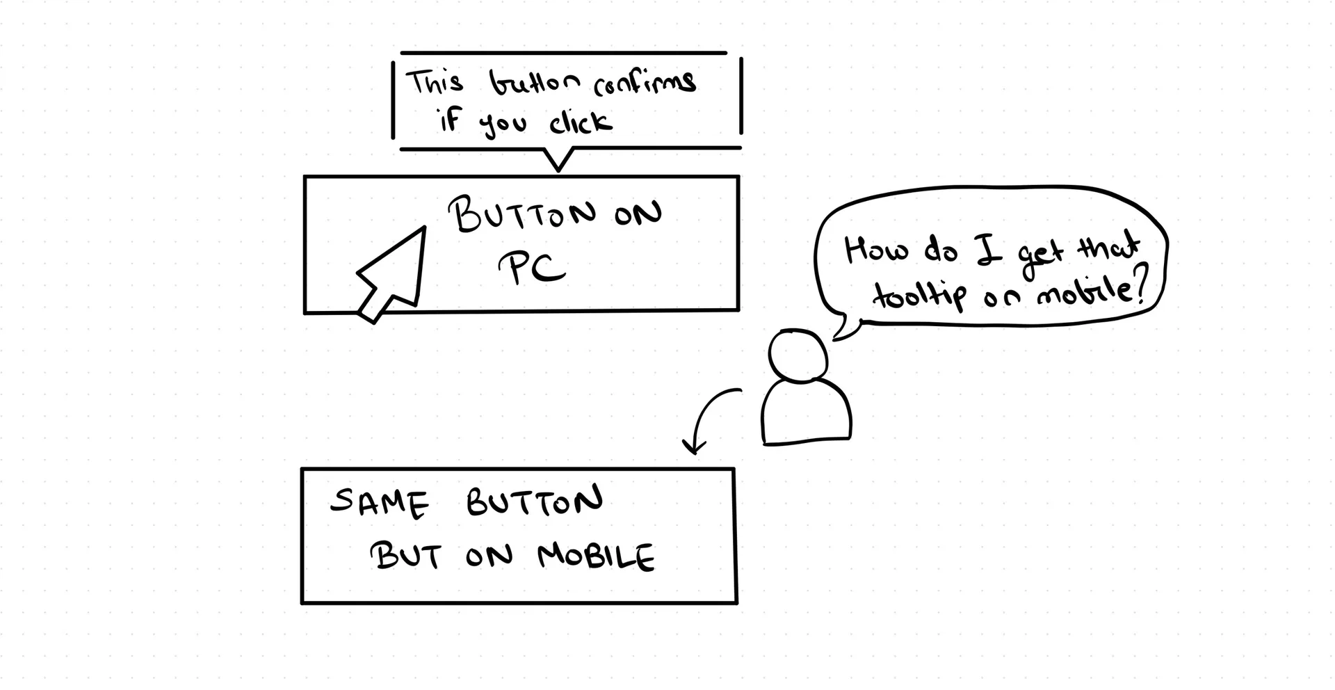
Failed to recreate contextual outcomes (e.g., hovering for tooltips) when switching platforms.
Since users were occupied with guitar chords and memorising complex techniques, it made no sense to add the cognitive load of also learning how to interact with this app on multiple platforms.
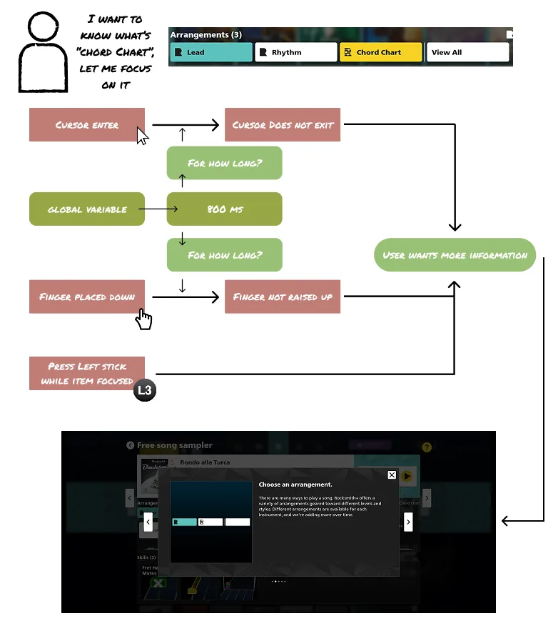
I created a 3-dimensional interaction matrix that mapped outcome → component → action on each platform and conducted many surveys to build an exhaustive list of commonly mapped translations between interactions. For example, hovering with a mouse cursor on desktop was majorly translated as touch and hold for mobile users.
Users could consistently achieve the same activities across platforms despite changing devices.
The original Rocksmith+ experience was built with only PC in mind, so many components had to undergo changes to be intuitive for mobile and console UI interactions. For example, on PC you scroll through a carousel by clicking arrows. On touch devices, you simply swipe.
A large part of my role was making all these small changes to the global design system and its component libraries to improve intuitiveness on mobile, PC, and consoles.
Felt confident about the mobile UI because it looked similar to an app they already used (e.g., Netflix, Spotify).
Working in a global team based out of San Francisco, Osaka, and Pune, I quickly learnt that project-wide impact on accessibility and a multi-device philosophy won't automatically result in a great product simply with my personal contributions. A large part of team alignment came from rooting discussion in user needs and coaching the team what a truly multi-device experience means — which included numerous coaching and workshop sessions on mobile interactions and games.
This was further challenged by language and cultural barriers in the midst of COVID-19 which meant we had to take an approach of overcommunication and actively building interpersonal relationships. While I am extremely proud of the product we put out which helps millions of humans learn guitar at their own pace at an affordable price point, I am even more proud of the team culture we built that allowed people working on it to grow their careers and improve their skill sets.
Hiroshi Ogawa
Lead UI Engineer, Ubisoft
Bramha made the foundation of Multi-platform UI, which was one of the biggest challenges in the project. His knowledge and insight always pushed our discussion forward. A clear design-based dialogue was productive and helpful in the cross-studio project in Japan and India. I respect his courage to accept the change, which is UX/UI design's most challenging part of improving the game while managing our resources.
Kaiwen Young
Director of User Experience, Ubisoft
Bramha's passion, knowledge and communication style contributed greatly to the quality of our project and team culture.
Rohit Suvarna
Senior Game Designer, Ubisoft
Bramha has a deep understanding of how to design user interfaces that are intuitive, effective and visually appealing. He is also an expert in user experience research and knows how to use data to drive his designs.
Utkarsh Bagade
Senior Engineer, Ubisoft
Bramha's approach to designing complex game systems always put UX at the highest priority. I'm very impressed by his ability to understand the tech (tools and engine) and designing features that take advantage of the current frameworks and help improve them.