01 · Problem
Category managers still rely on 1–2 discreet store visits a year to guess what competitors stock, promote, and display. There is no structured weekly data.
An 8-week Planoverse pilot that turned Woolworths and Coles in-store mobile APIs into daily shelf intelligence for category managers.
Category managers still rely on 1–2 discreet store visits a year to guess what competitors stock, promote, and display. There is no structured weekly data.
Woolworths and Coles already expose in-store assortment, stock status, and aisle coordinates inside their mobile apps. I built a pipeline to retrieve it daily and match SKUs across banners.
An 8-week pilot turned that API data into shelf intelligence executives could act on: bay share, adjacency, and range store to store. Woolworths signed after the pilot.
Scroll for the full case study ↓
Category managers at large grocers allocate capital, range, and promo spend from one question: what are competitors doing this week? That answer drives which SKUs stay on shelf, which suburbs get which offers, and whether shoppers leave thinking your store is the expensive one.
Retailers pay heavily for that signal. The usual method is still a person walking a rival store once or twice a year, scribbling notes on facings and end caps. Photos are risky. You can get escorted out. The output is anecdotal, not comparable week to week.
At Planoverse I built a demo and pilot for Woolworths that replaced those visits with structured daily data: price, stock, aisle, bay, and coordinates pulled from the same in-store flows shoppers already use on mobile.
Competitive intelligence in grocery has no shared schema. Every banner names categories differently, uses different barcodes for the same pack size, and hides layout detail outside the apps built for shoppers.
The best manual programs still sample a handful of locations. Promo matching stays lagged by months.
Teams want evidence. Stores do not want cameras in every aisle.
Range and price perception decisions run on incomplete competitor pictures.
Woolworths and Coles already publish in-store assortment inside their mobile apps: search, stock status, and pathfinding to a product on the floor. That data does not appear on the public website in a form category teams can subscribe to.
I built a daily collection process that reads those apps like a shopper, stores the raw results, matches equivalent products across banners, and publishes shelf intelligence to the Planoverse dashboard. Category managers never touch the source systems — they get refreshed charts and store maps each morning.
Parallel collection from both banners, then a single transform and publish path each morning.
The two banners use different product names, barcodes, and category trees for the same item on shelf. Matching happens bottom up: pair SKUs first, then derive shared categories from those pairs.
Pair equivalent SKUs first, then derive shared category labels from those pairs.
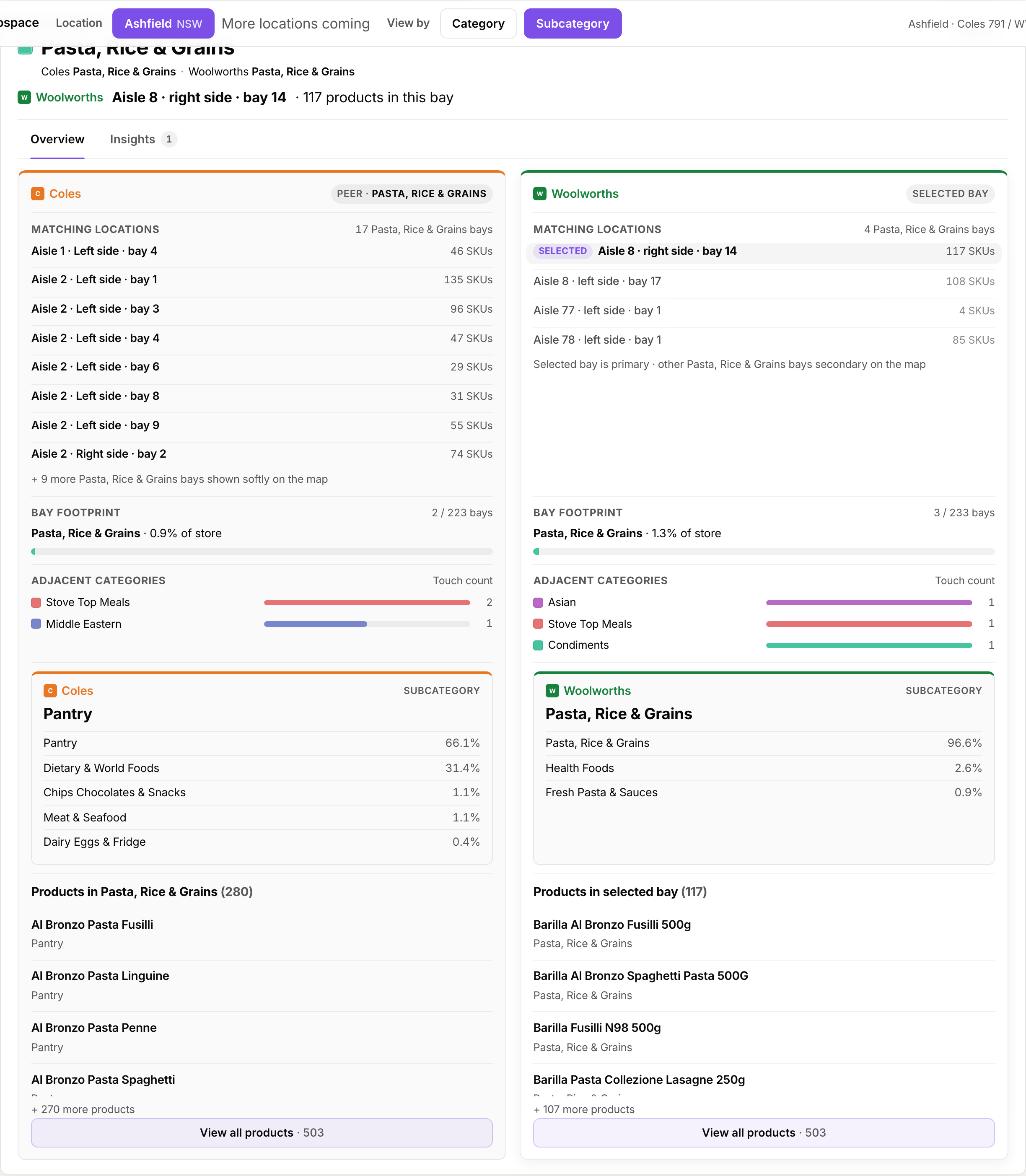
Woolworths executives asked one question first: how does shelf space in our store compare to the Coles down the road? I built a butterfly chart of bay-equivalent share by subcategory, store by store.
Woolworths "Pantry" splinters across Pantry, Chips and Chocolate, Dietary, and World Foods on Coles. Stakeholders needed two-way mapping built bottom up: match products first, derive shared categories second.
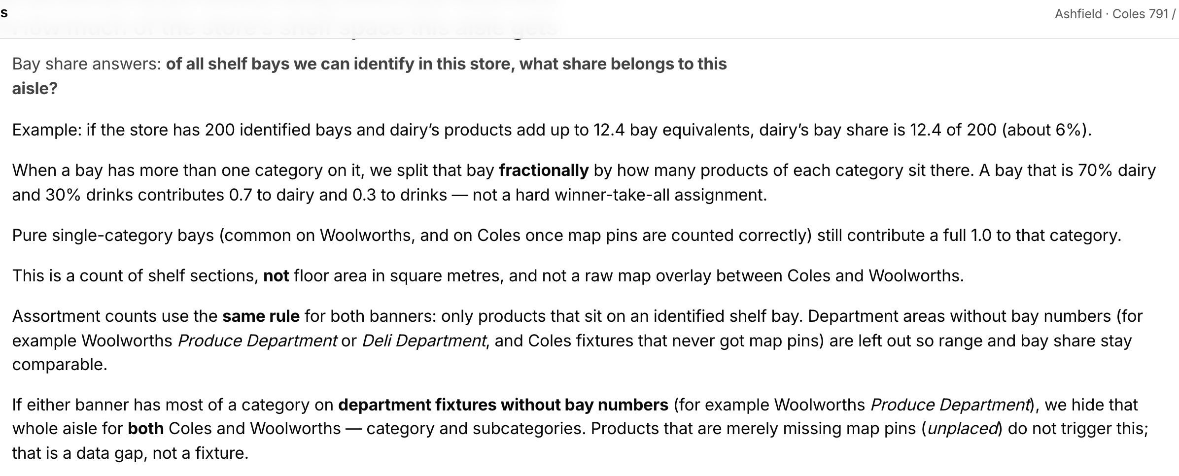
Executives would not trust cross-banner numbers unless the math was visible. Inline explanations for bay share, adjacency, and mapping rules let category leaders self-serve without a customer success rep in the room.
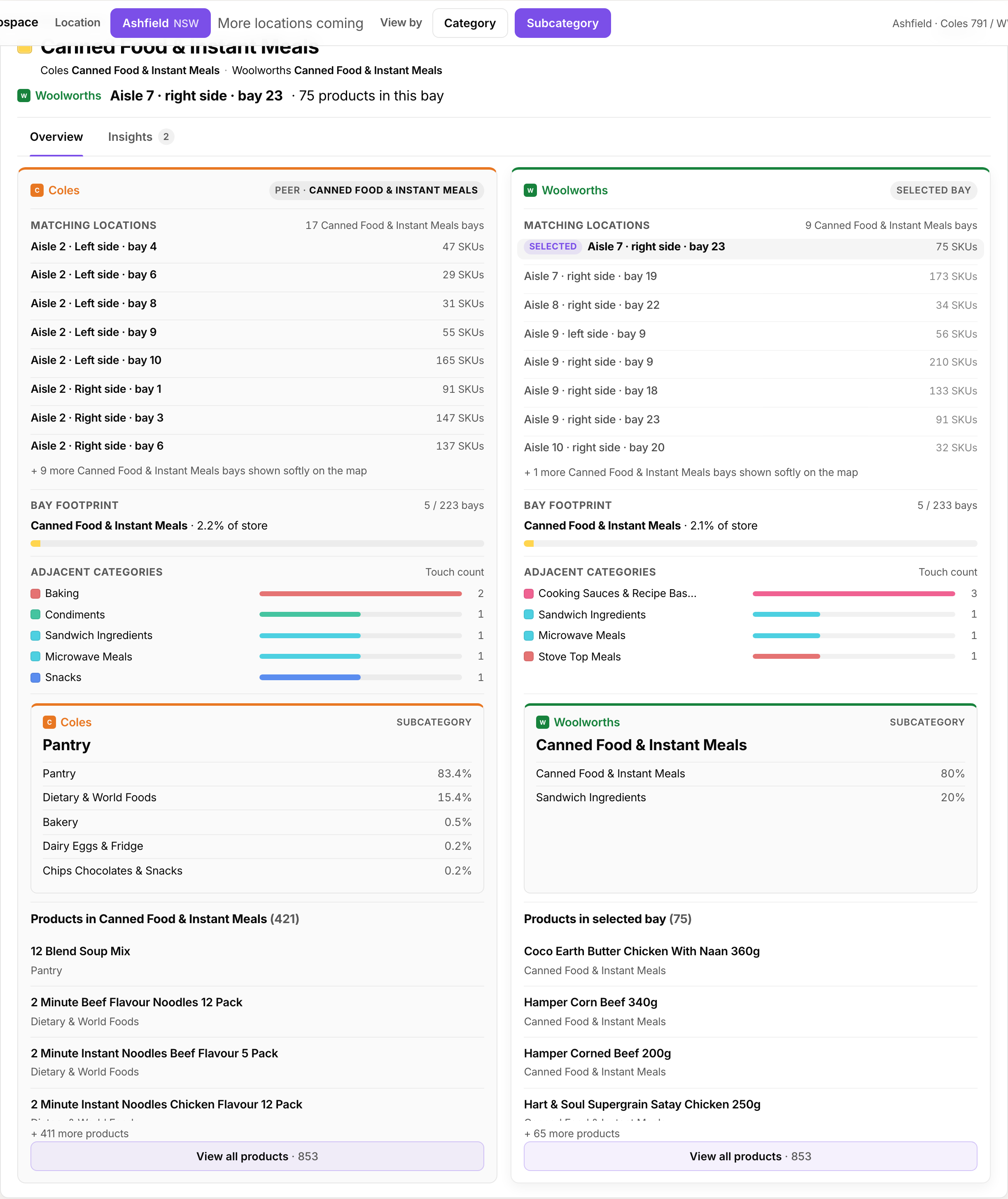
Macro layout is which categories sit beside each other on the floor. That placement drives basket size: bread next to honey on promo pulls incremental spend. Every store team wants the competitor map, not a spreadsheet of SKUs.
I built an interactive floor plan per banner: pan, zoom, tap a bay, compare product to product or category to category, then export a standardised view for leadership reviews.
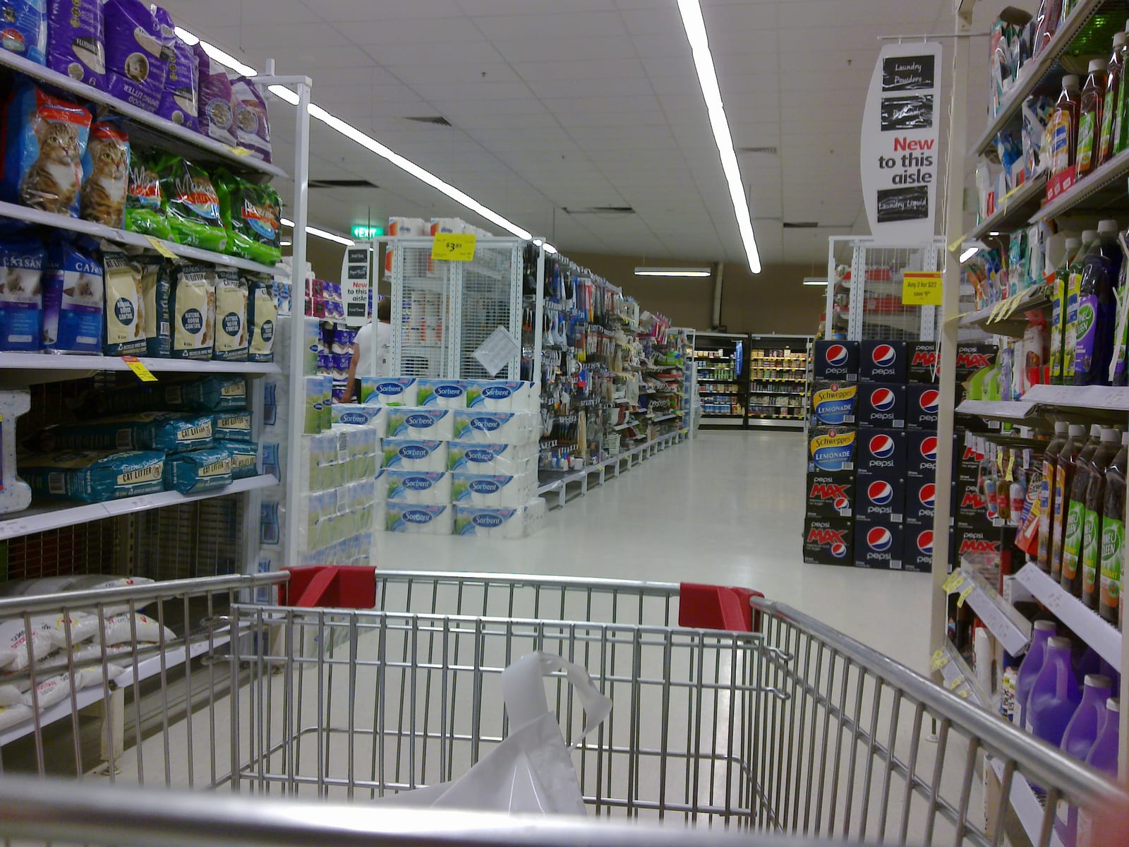
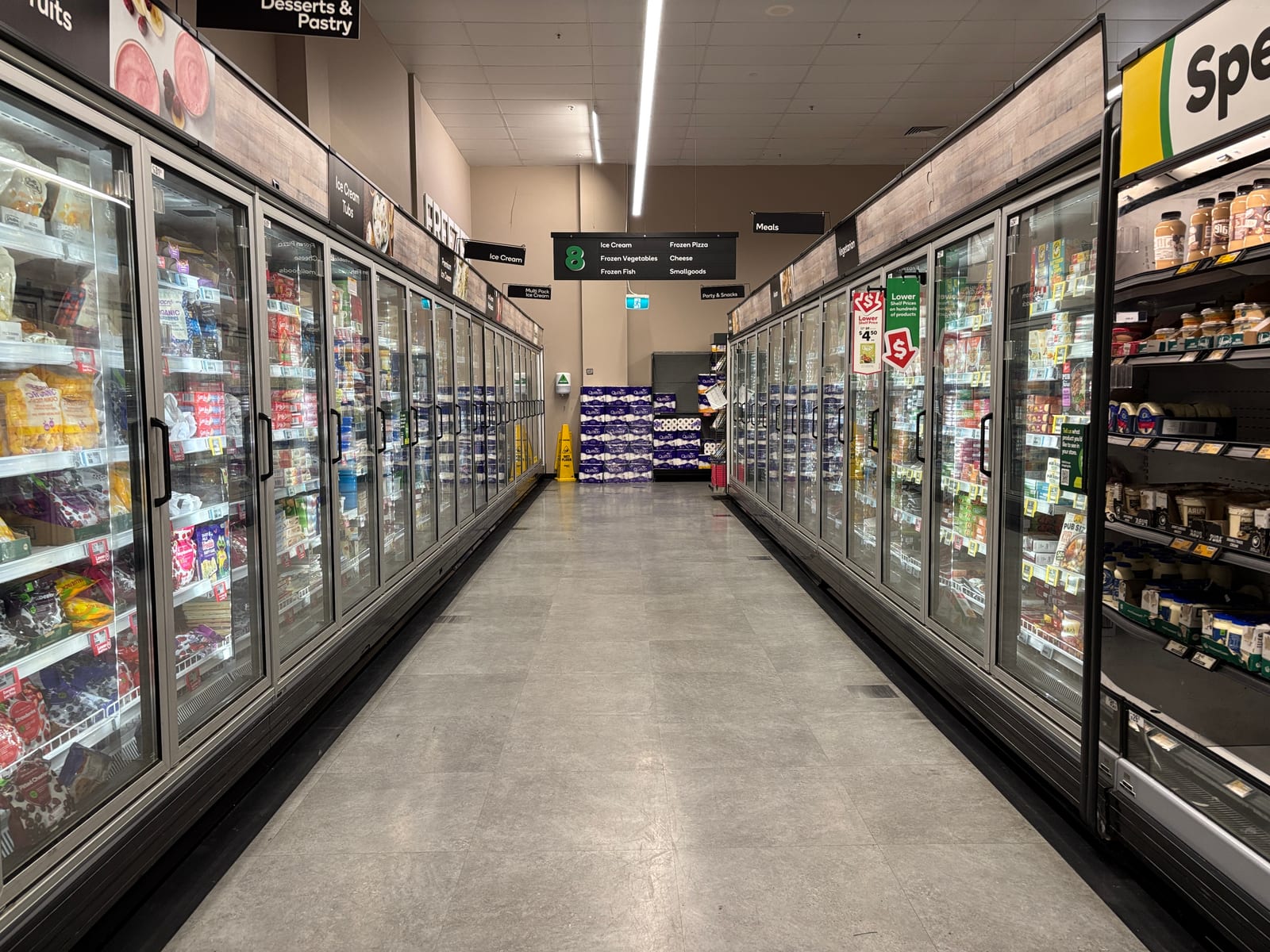
Dashboards are easy to distrust when the numbers come from someone else's pipeline. We printed the aisle and bay outputs and walked our local Coles and Woolworths with the sheets in hand.
Bay labels, adjacency, and category splits matched what we saw on the floor. A few edge cases were off — mostly Coles bays where map pins had not resolved to a bay number yet — but the macro layout and share-of-store rankings held up. That visit is what got category managers comfortable signing off on the pilot.
The Woolworths pilot converted to a contract. Category leaders said they had not seen competitor shelf data at this granularity before: daily refresh, bay-level coordinates, and explicit mapping between banner taxonomies.
Data without process transparency does not get used. The hard part was explaining how pairs, bay fractions, and category crosswalks worked without publishing the parts of the scrape stack we treat as trade secrets. Documented methodology carried more weight than another dashboard tile.