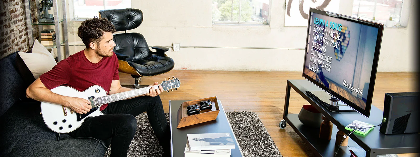
Building Rocksmith+ for 5 platforms with 1 UI system for consistent user experience
Executive Summary
Role: UX Lead for Mobile UI and contributor on multi-platform interactions
Rest of the Team: 6 people on the UX team → 2 UX Designers | 2 UI Artists | 2 UI Engineers
01. The Problem
Fragmentation: Rocksmith+ faced a massive scaling challenge: launching a PC-first MVP on Mobile and Console simultaneously. Without a unified framework, the team faced tripled maintenance costs and a siloed UX that failed to respect the varying environmental contexts of guitar learners.
02. The Solution
Building a responsive UI system: I architected a technical UI system in the Snowdrop engine that scaled responsive UI across different PC monitors, TVs, tablets, and mobiles. This ensured visual parity across devices ranging from 4:3 iPads to 21:9 Ultra-wide monitors without bespoke adjustments.
Context
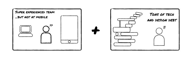
I joined the team in 2020 when Rocksmith+ was in pre-launch production and Ubisoft wanted a global release on mobile, PC, and next-gen game consoles (at that time, it was the Playstation 5 and Xbox Series X). Very few people on the UX team had prior experience building a mobile user experiences and responsive UIs and interactions for multiple platforms.
The MVP for Rocksmith+ was also built only for PC. My goal was to deliver it on Mobile and Tablets in addition to Consoles (PS5 and Xbox Series X) to invite a whole new audience of guitar learners from around the globe.
I faced these challenges at the start
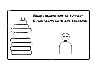
And drove to these outcomes

Actions
TLDR
Problems analysed through a mixture of quantitiative and qualitative data analysis
- No mobile and console framework for responsive UI and interactions
- No parity between PC, consoles, and mobile codebase → everything needed 3 times more effort to simply maintain and accomodate new changes
- Immature team culture around global collaboration and building one codebase for launching on five platforms → no one's fault, just lacked having people accountable for driving
How I fixed these problems
- Leading the effort with hands-on work to design, document, and share core mobile UI and mobile + console interaction frameworks while critical foundational work was being done to the engine and PC version by the rest of the team
- Led responsive UI striketeam to build foundational tooling to support 5 screen types (16:9. 16:10, 21:9, 19.5:9, 3:4 and everything in between) and 5 platforms (PC, Playstation, Xbox, Apple, and Android) and reduce custom work per screen and platform type
- Leading India <> Japan <> US team workshops for UX design and Technical UI teams to drive a collaborative spirit around multiplatform design instead of building platforms in silos and porting them over
You can see the final solution is a run-time responsive UI that made it easy to support different aspect ratio screen types and platforms without needing to support multiple codebases
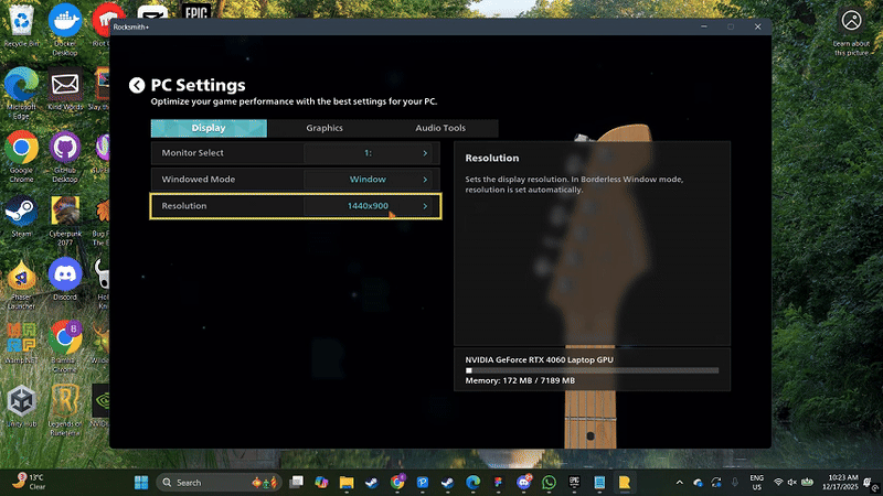
You can see the input diagrams in the Rocksmith+ settings screen to get a high level view of the final interaction design system, but many nitty gritty details are included in the body of this case study.
Solution
The block of work to create the Rocksmith+ mobile experience was a collection of many small steps. The first piece of work started with lots of user testing where I requested internal and external volunteers to play a crude, ported version of the PC version of their game on their mobile and tablet without any scaling and no interactions except simple taps. My first few initial tests were to discover how people set up a portable device compared to playing on a PC or a TV (plugged in to a console) to understand context and environment in which Rocksmith+ will be experienced.
The tests gleaned insights using three primary methods
- Observational studies and contextual interviews with internal and external volunteers
- Surveys after each playtest to track progress of key success signals via ability to learn on mobile as compared to PC, satisfaction of learning experience, satisfaction of interaction, and NPS surveys
- Diary Studies with strictly internal, non-development staff who do not have insights into development (Ubisoft at that time had 20,000 employees, recruiting internal employees was not a challenge) to see how needs evolved as users went from beginners to power users
Throughout the virtual and in person testing sessions I made notes of various environments a user learn guitars in, such as
- Placing their phone on various physical contexts ranging from kitchen countertops to dedicated desks
- Plugging in their guitars into a myriad of equipment - from pedals used by advanced guitar players to headphones so a parent can practice playing the guitar without disturbing the children
- Placing the devices at different distances away from themselves so as to have room to play their instruments in different positions and with different techniques

What I quickly realised was that the UI cannot be one size fits all for this experience. Users need tons of customisability to change the experience to their needs
- The ability to zoom in and zoom out on the guitar lessons based on how far they have placed the device from themselves
- The ability to scale the UI so that button are bigger if the device is farther away and they have to operate it while holding a guitar
- Other less frequently used by important controls such as changing field of view of the guitar lesson to change the available information
Not only did we need a responsive UI that adjusted to various form factors and aspect ratio, users needed customisability to adjust to their personal context which was on a wide spectrum.
So I first began with working on a core responsive UI that would offer the base experience on all devices. It involved not only designing and validating layouts in Figma, but also working closely with UI engineers to build appropriate tools such as
- UI component anchoring and scaling so that UI elements know exactly where to stay and how to best use screen real estate and maintain a consistent layout on the hundreds of devices this game will be played (TVs, monitors, tablets, and phones of upto 8 standard aspect ratio configurations)
- Aspect ratio based scaling rules, so that UI elements know exactly how to scale in proportion to the screen. We collectively opted to use percentage based scaling to maintain consistency and not have too many breakpoints to change the UI
- Aspect ratio break point table, so we can create bespoke rules for brackets of devices (some UI rules on phone were needed custom work on tablet, some rules on tablets were needed custom work on monitors and TVs, etc.)
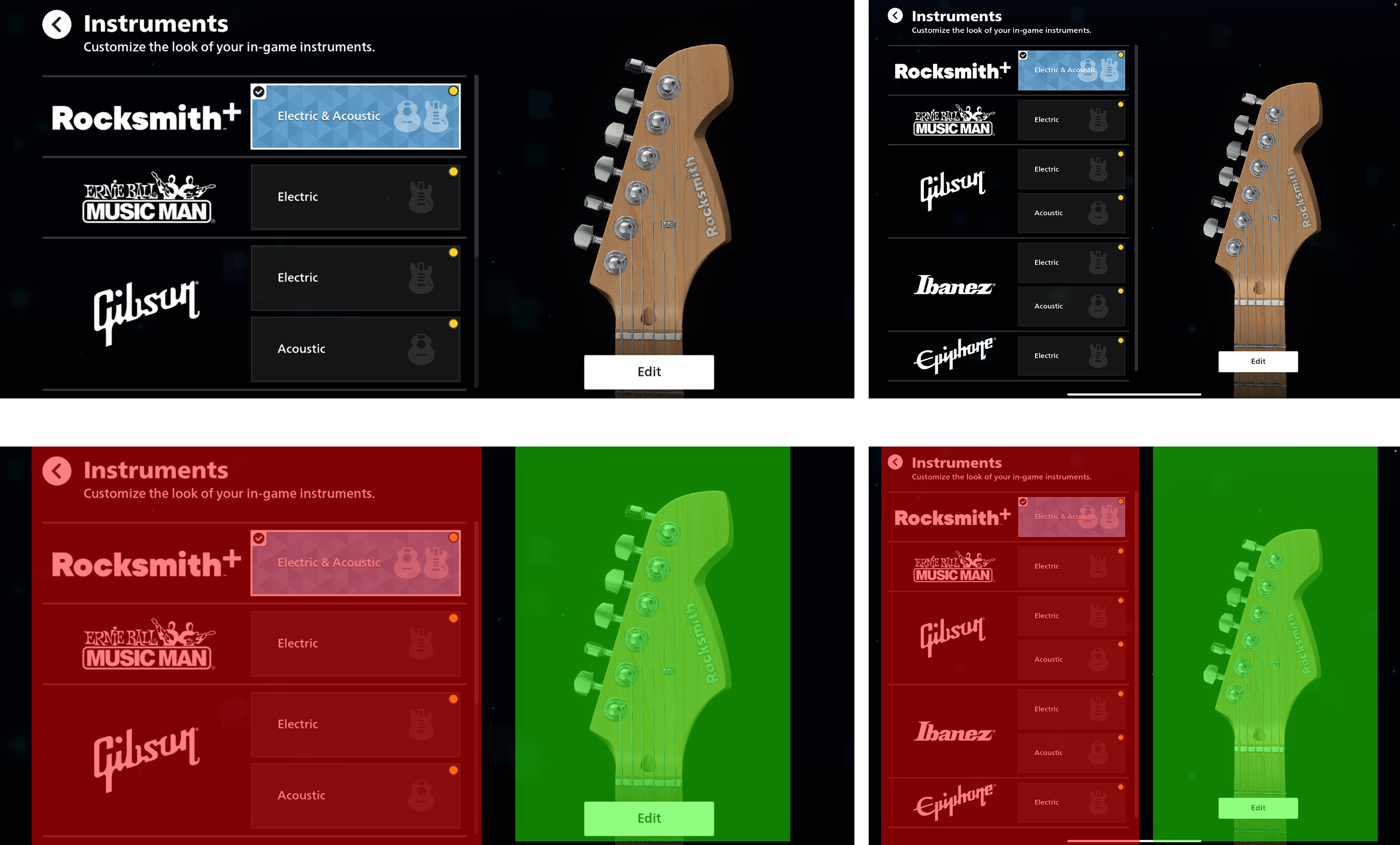
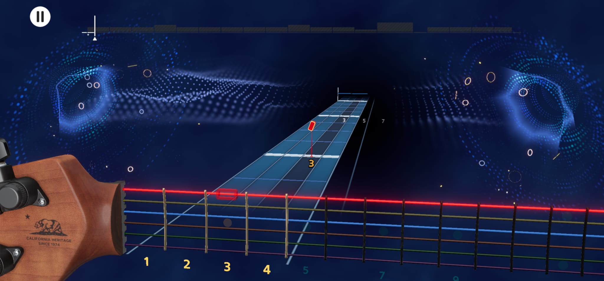
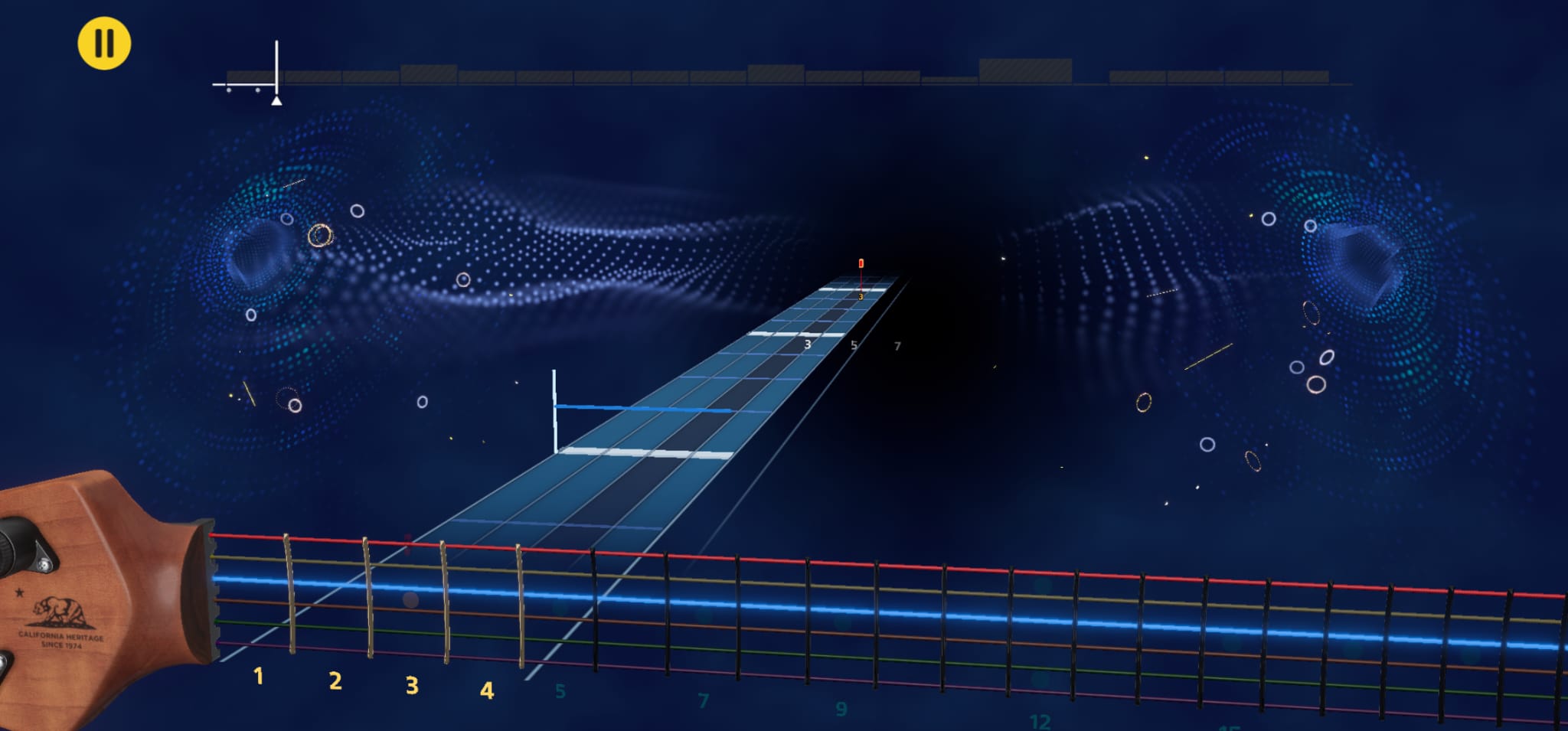
The app on an iPad pro (13 inch 4:3 aspect ratio) vs a Samsung galaxy phone (7 inch 21:9 aspect ratio)
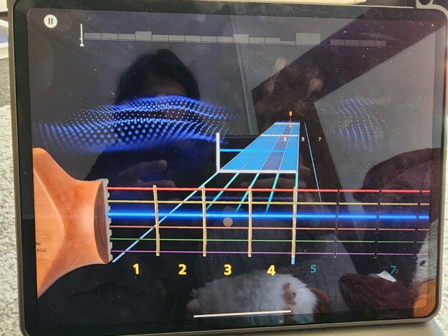
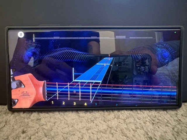
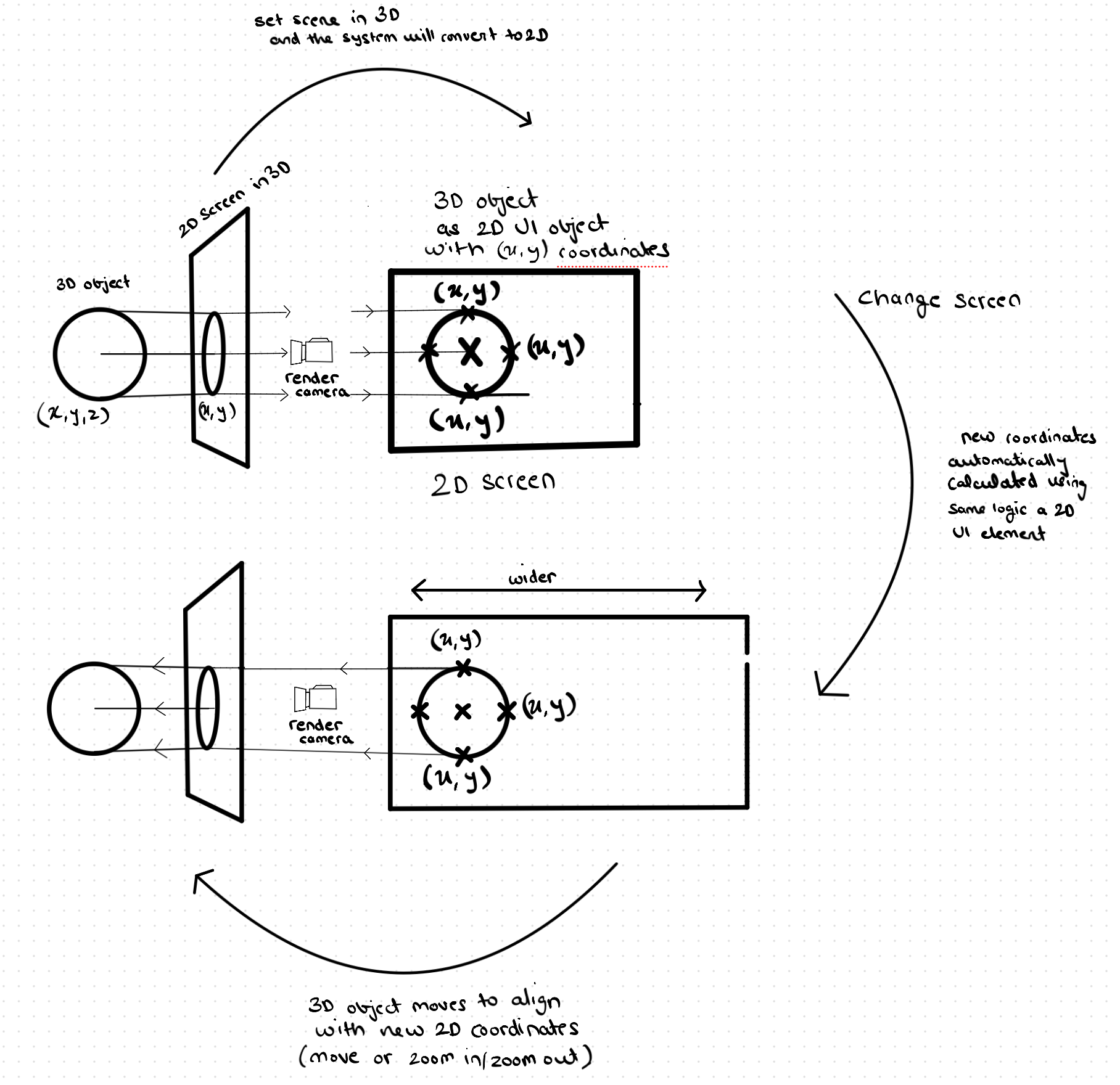
The tricky part was making a responsive UI was the 3 dimensional objects in the UI. For that, I worked very closely with the UI engineers to develop a custom system where an anchor point and multiple boundary points were projected from the 2D screen into a 3D space on the screen. Once the appropriate 3D anchor points were calculated for any screen the camera adjusted in such a way that the the 3D point was placed perfectly where the 2D point was supposed to be on the screen. The result was a reactive camera system that could be configured like a 2D UI and the camera would adapt automatically. Basically, it meant that 3D elements could be designed and treated as 2D elements in the UI.
It would automatically know how much to zoom in or out and how to move left and right to make sure all the 3D objects appeared at the correct places on the screen no matter the aspect ratio and screen resolution of the device, whether it was a nearly square ipad or a really wide phone. The MVP of this solution achieved usable display results on all 5 target aspect ratios and different devices which broadly encompassed 90% of the devices or screens we expected the app to be used on out of the box.
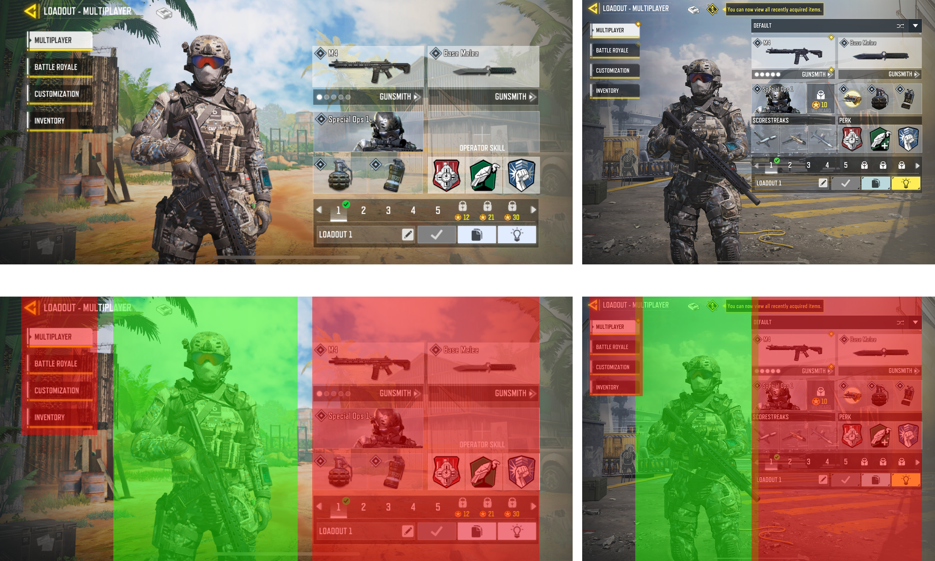
Here is the fundamental difference of how the UI with 3D objects are treated in Rocksmith+ compared to most other games (Call of Duty mobile used an example here)
Fun fact - this reason is exactly why many games put their characters in the center of the screen
The new UI was responsive in runtime without any overalapping of 3D and 2D elements
Here is a live test of the demonstrating the 3D-to-2D anchoring system, ensuring that all 2D and 3D elements remain legible and correctly positioned regardless of the user's monitor resolution or aspect ratio.
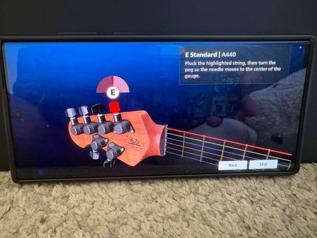
Accessibility was a core tenet of the experience we set out to design, this included the ability to users to customise the experience to their needs.
One of the first accessibility feature we developed was allowing users to modify the scale of their UI to fine tune their mobile and tablet experience based on how far they kept their device. The distance between user and device heavily changed based on whether they were advanced guitar players or beginners, whether they played easy or difficult songs, whether they played bass or guitar, whether they played a full 34" bass or some other size, or if they played different guitars, whether they had equipment such as pedals, amps, or headphones attached.

This customisation system was easy to build as my team had already worked on a dynamic system to make our 3D UI responsive (as you may have read above). The original system, being built on solid technical foundations, meant that users could change their configuration at run time meaning they could change whenever they wanted and however many times they wanted. While I did not directly work on this exact accessibility feature, a lot of the foundational work that my team did made it easier to imagine and develop these features rapidly.
Since one single subscription of Rocksmith+ gave access to the game on every platform, we expected the user to using the app on multiple platforms - think Netflix where you use it on your TV, tablets, and sometimes phones.
This is why we needed a consistent outcomes for users from the user actions on different platforms over and over again. Since their minds were occupied with guitar chords and memorising other complex techniques, it made no sense to add the cognitive load of also learning how to interact with this app on multiple platforms.
The first version of a unified interaction system was an interaction matrix for achieving the most important outcomes.
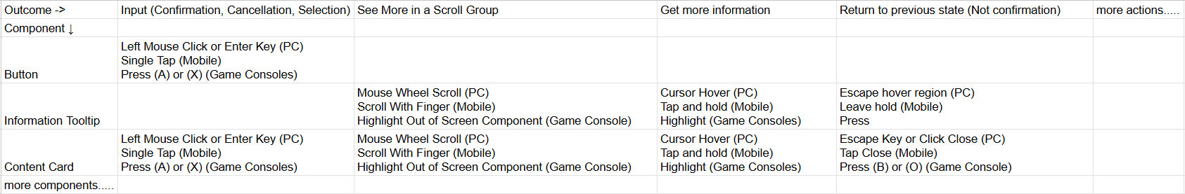
Once I had collected an exhaustive list of what users commonly mapped various interactions on various platforms to specific outcomes, I made sure to map the mechanics of a device with each other to build a cohesive system so figure out how to unify them in in terms of implementation.
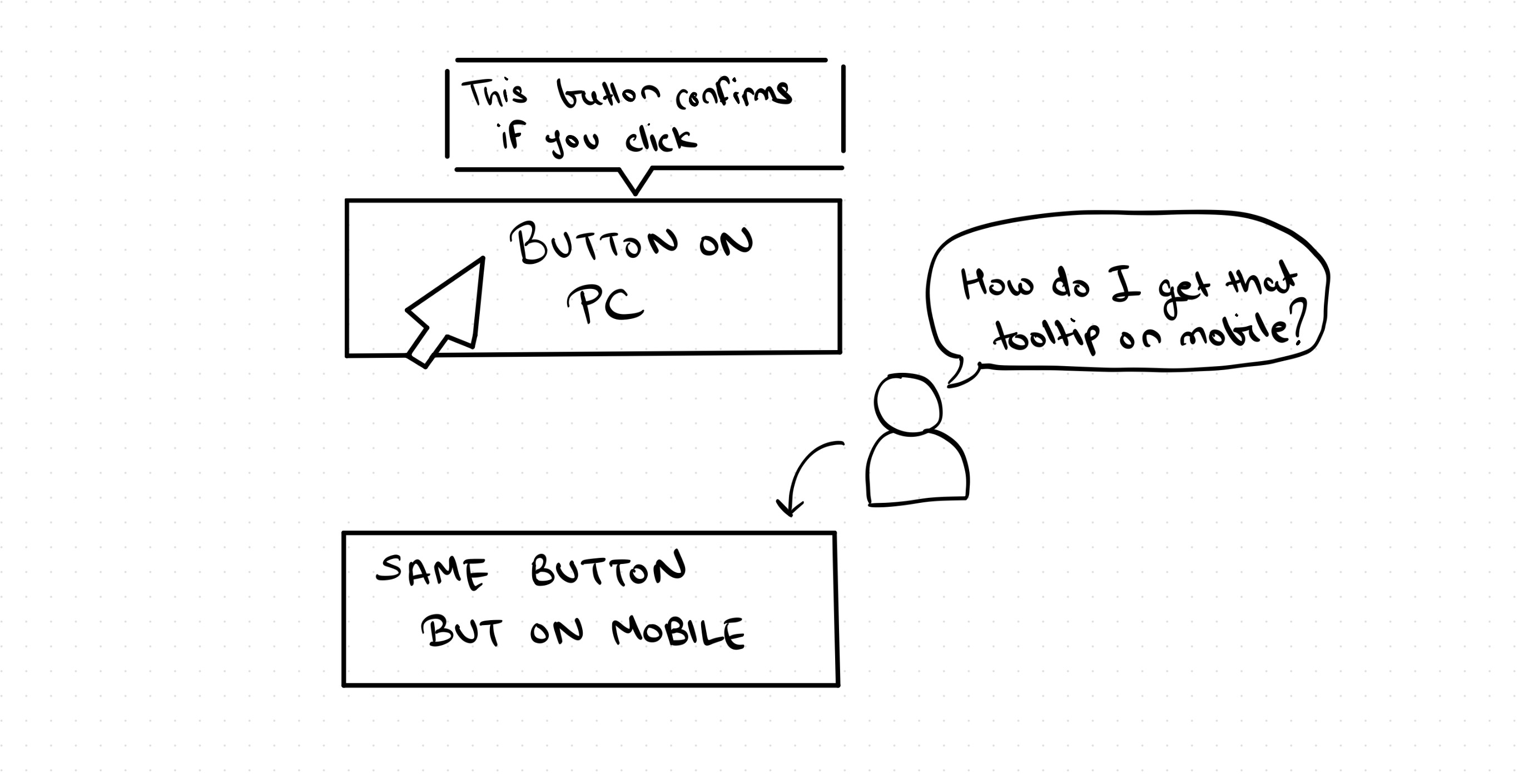
For example, on PC, there is a UI event called hover which is activated when a cursor enters a region and does not exit the area or make an action like a click for 600 micro seconds. This is mapped to a user hovering on an item to want more information via a tooltip which is common in most software and games.
For touch devices, we had an event when a finger was placed on an item, but did not lift it up for 600 micro seconds. This registered as a tap and hold, which was also mapped to wanting more information through a tooltip about the item. In both cases, the help tooltip was created as a hovering element next to the original element so it wasn't obscured by the cursor or the finger.
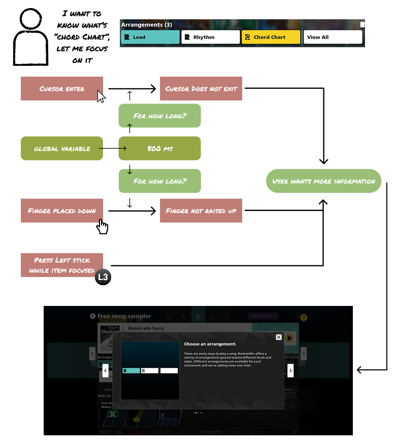
This ensured that under the hood, the technical interaction system was just as consistent as the outcomes of these interactions for the users which made it easy to maintain and scale the system rapidly as the number of screens and number of instances of a component started increasing exponentially later in development. Maintainability was greatly improved - for example, whenver the team wanted to change the time of hover or tap and hold from 600ms to 300ms for bringing up the tooltip, we would have to make the change in one place instead of maintaining two separate interaction patterns for the same outcome from a user's point of view
The original Rocksmith+ experience was also built with only PC in mind, so a lot of the component had to undergo changes to be intuitive for mobile and console UI interactions.
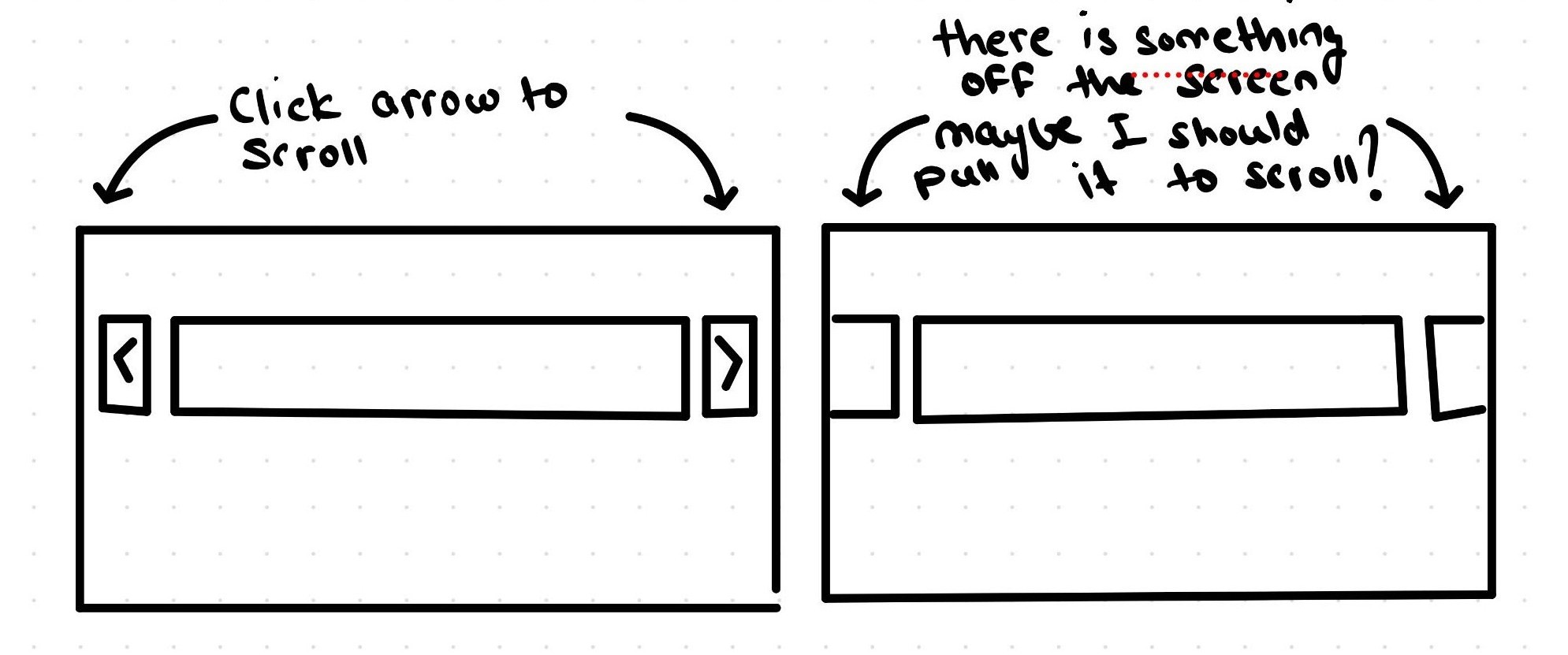
For example, on a PC you would scroll through a carousel by clicking left and right arrows. You would do the same on a game console by using the bumper buttons. But on a touch device, do you remember the last time you clicked a button to scroll? Instead you will see your feed extends beyond the screen, and you simply scroll to access those items outside the screen. The UI is built to lead to and teach these natural behaviours that Rocksmith's prototype version was missing as it was built PC first.
A large part of my role was making all these small changes to the global design system and its component libraries to improve intuitiveness on mobile, PC, and consoles.
Another major issue I tackled was menu navigation for consoles. With a heavy focus on PC for launch and on mobile for mass scale adoption, adhering to interaction quality on consoles was lagging behind.
For example, the original prototypes included expanders with nested scrolls to hide secondary information. While this is a common design pattern for Desktop where users have a mouse and on mobile where users can touch, on consoles it created a major issue.
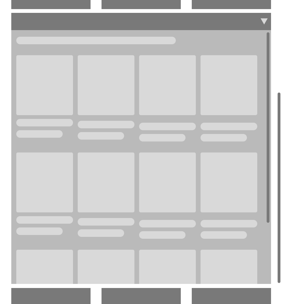
When you are on PC or mobile, you can scroll the outer container independent of the inner container by focusing on it with touch or placing your cusror on it. When you want to exit, you can focus on the outer container to scroll to the header of the expander and close it.
But on consoles, you cannot independently focus on a seperate item, because all directional input is mapped to the item in focus. That means regardless if you use the d-pad or either of the sticks, you can only scroll the expanded container till it is in focus and must scroll all the way up till you can reach the header to close it.
My first gut reaction was to try mapping one stick input for scrolling the container in focus and have the other stick input fixed to always scrolling the root container.
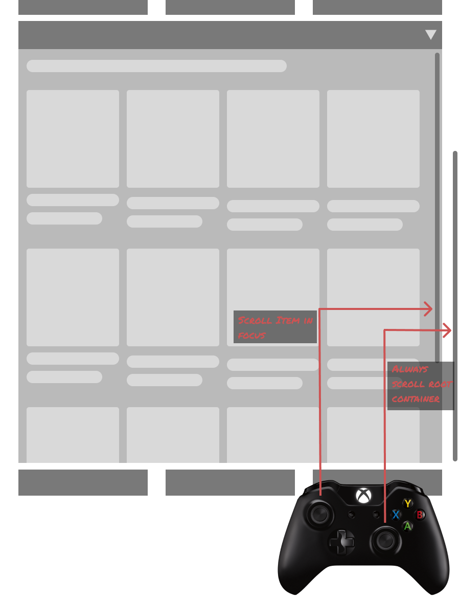
This would allow users to always have a way to escape nested scroll which was a dominant interaction pattern in the product at this point of development. This solution had 2 core problems that came out from playtesting and internal reviews
- This is not a natural pattern in video game menu UIs. There are no mainstream games where you can input 2 UI elements using two different sticks and this was not intuitive to users
- One of our main goal was to let users control the UI with one hand only as the other would probably be holding a guitar. This interaction pattern required 2 hands at times
For these reasons, this solution was a no-go.
Going back to the drawing board, I drafted up 2-3 more solutions to discuss with my team. One solution proposed by the technical designers in my team was using a two axis design patterm - the vertical axis for moving between different components and the horizontal axis for accessing information of that component. I created multiple quick iterations in Figma to explore commonalities and differences between horizontal scrolls on PC, mobile, and consoles and we quickly landed at a rough solution with a horizontal scroll system at a container level which unlocked an improved, more user friendly design pattern for console and reused many components from PC/mobile.
When looking at a song, the "skills" used to be in an expander as they were secondary information for mature users. The original UI had a lot more detail and through time bound, MVP-mindset development it evolved into an expander. After choosing to move away from design patterns that are unfriendly for consoles, this was the first component to get added to a horizontal scroll.
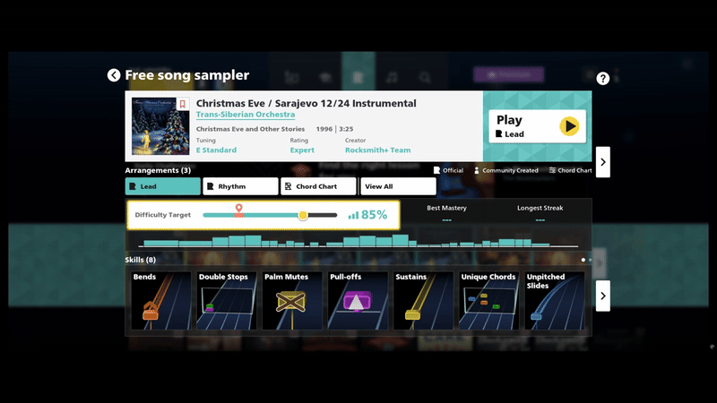
The tradeoff in this particular situation was that the skills tile was streamlined and lost a lot of detail that was originally available at a single glance. Considering the ease of use for overall navigation, this tradeoff was accepted by the entire team.
The original mockup cannot be recovered now so I have recreated a very rough version of what it used to look like from memory to give you an idea of the tradeoff.

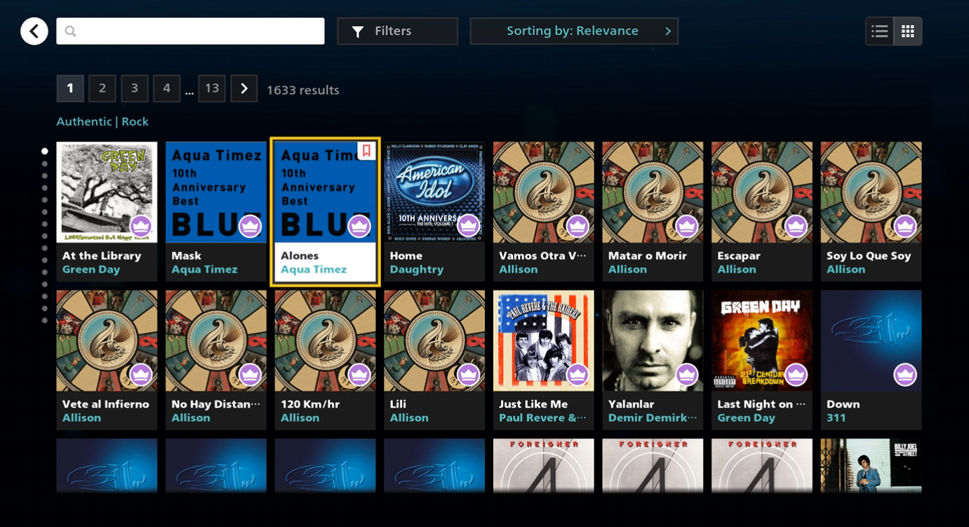
Once we streamlined horizontal and vertical scrolling, some action items to refine and polish were noted during playtests. One key item was when users would vertically scroll either using keyboard keys or a controller, the first item of that row's horizontal scroll would be focused by default. Because our UI was similar to Netflix in terms of volume of content, this made it very difficult to visually track the how vertical scroll reset horizontal scroll.
I worked very closely with a Senior Engineer on building a solution for consistent focusing on elements in a two axis interaction - whenever users would vertically scroll, the item closest to the current item in focus would focus. While this was relatively simple in uniform grids with, this was a little tricky in rows with non-uniform content. For this, we used approximation based on how many spots in a horizontal grid an element took.
For example, if you are focused on tile number 3 in row 3, and move to row 4, it's simply focusing on tile number 3 in row 4 as well.
But when scrolling from point A to point B in an irregular grid, it was difficult to predict the user intent. So I opted to rather maintain clear visual anchoring such that the item focused would be closest to the current item in focus.
If you are focused in tile number 3 on row 2 and move to row 3 with non-uniform items, then the UI will focus on the item closest in presence of tile number 3 in that container by using tile calculation - if the item in focus is 2 items from the left anchor then move to the item closest to 2 items from the left in the next container. This solution was not completely watertight as it would have some edge cases where the horizontal scroll did not adhere to strict grid based placement. But when we specifically asked our playtest moderator to keep an eye on this issue and included a question "comparing to other main menus such as your console's game library, did you have any issues with the Rocksmith+ main menu?" with a binary yes or no answer. 100% of the results came in as "yes" and the moderator had nothing to report about the navigation. This was a big success.
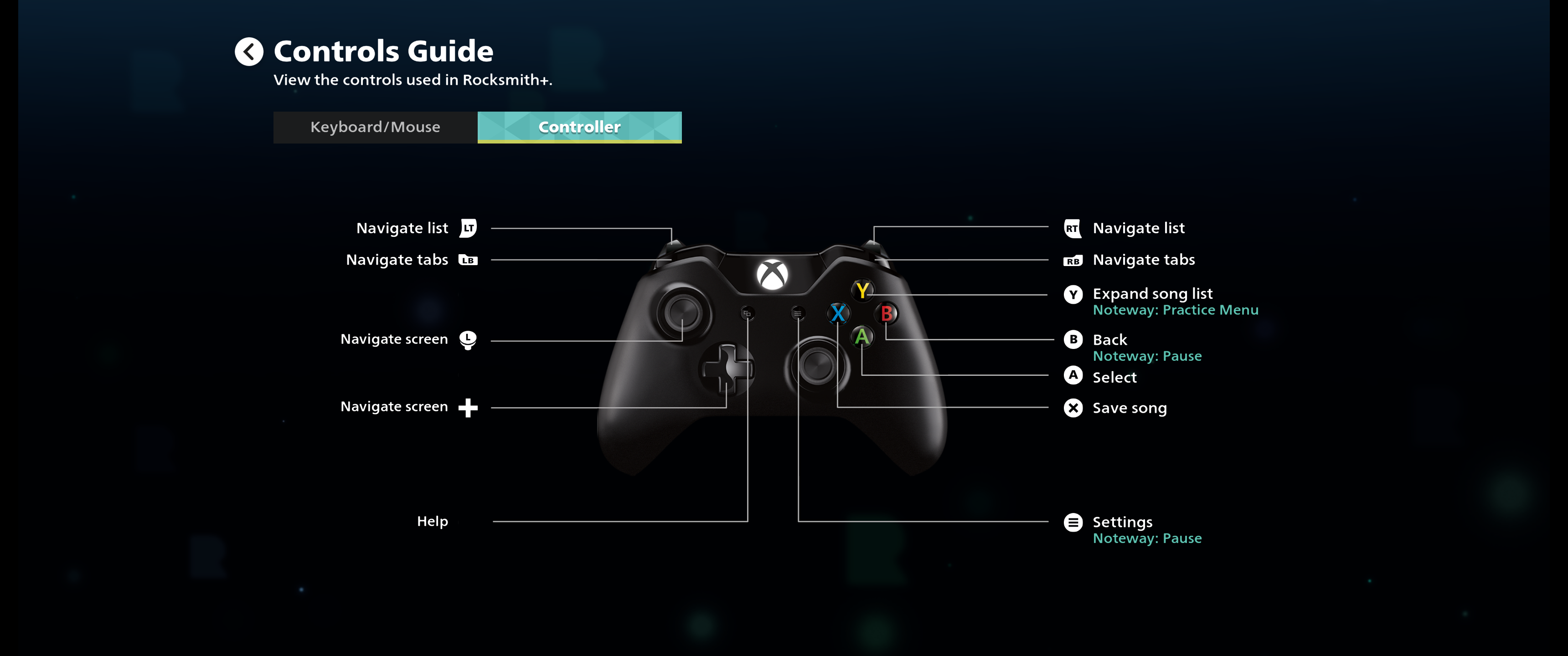
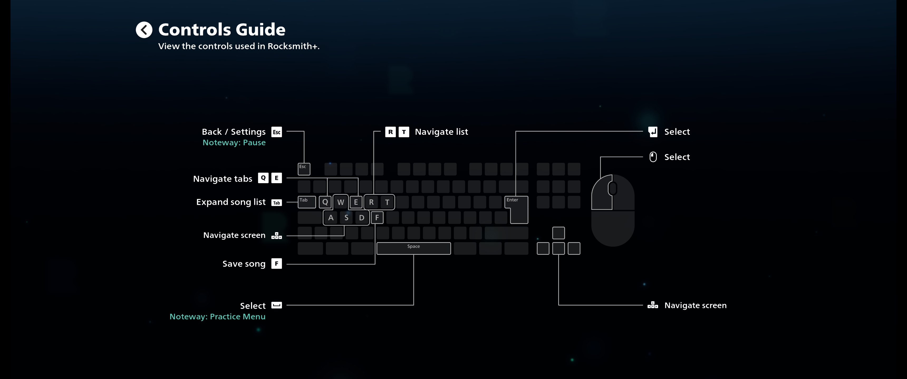
This entire interaction pattern was represented by this diagram in our control scheme screen.


Result
Rocksmith+ launched in open beta and swiftly followed a global launch in 2022. The mobile version was able to unlock a completely new market of on-the-go learner who did not have the money, time, or privilege of learning to play the guitar on a computer or a game console. The new and improved accessibility feature set also garnered critical acclaim when Rocksmith+ won the Game's Accessibility Conference's award for Best physical / mobility accessibility.
But don't take my word about success on mobile, listen to real Rocksmith+ users talk about the mobile version
Learning
Working in a global team based on out San Francisco, Osaka, and Pune, I quickly learnt that project wide impact on accessibility and a multi-device philosophy won't automatically result in a great product simply with my personal contributions. A large part of team alignment came from rooting discussion in user needs and coaching the team what a truly multi device experience means which included numerous coaching and workshop sessions on mobile interactions and games. This was further challenged by language and cultural barriers in the midst of COVID-19 which meant we had to take an approach of overcommunication and actively building interpersonal relationships. While I am extremely proud of the product we put out which helps millions of humans learn guitar at their own pace at an affordable price point, I am even more proud of the team culture we built to be able to put deliver so much innovation that allowed people working on it to grow their careers and improve their skill sets.
What my colleagues from this project say about me
Hiroshi Ogawa, Lead UI Engineer, Ubisoft
"Bramha made the foundation of Multi-platform UI, which was one of the biggest challenges in the project. His knowledge and insight always pushed our discussion forward. A clear design-based dialogue was productive and helpful in the cross-studio project in Japan and India.
I respect his courage to accept the change, which is UX/UI design's most challenging part of improving the game while managing our resources"
Kaiwen Young, Director of User Experience, Ubisoft
"Bramha’s passion, knowledge and communication style contributed greatly to the quality of our project and team UX culture"
Rohit Suvarna, Senior Game Designer, Ubisoft
"Bramha has a deep understanding of how to design user interfaces that are intuitive, effective and visually appealing. He is also an expert in user experience research and knows how to use data to drive his designs."
Utkarsh Bagade, Senior Engineer, Ubisoft
"Bramha's approach to designing complex game systems always put UX at the highest priority. I’m very impressed by his ability to understand the tech (tools and engine) and designing features that take advantage of the current frameworks and help improve them."
Do you want to see more hands on work? Check out my personal projects!