Increasing D7 Retention by 25% through Data-Driven UX and Feature Design
Executive Summary
Role: Feature Owner and Lead UX Designer
Rest of the Team: 1 UI Artist | 1 UI Engineer | 1 Full Stack Engineer
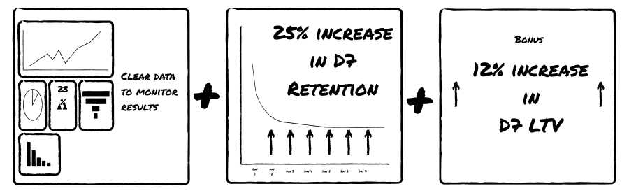
Impact:
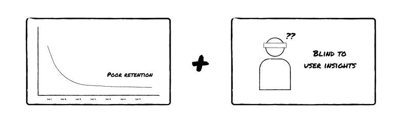
01. The Problem
The game suffered from a lower than standard D7 retention. Users reported that they needed to play 3-4 times a day to maximise their progression when most players only had time to play 1-2 times a day, creating an ill fit for user lifestyle needs.
02. The Data
Using SQL (BigQuery), I identified that the most engaged users were pulling the average enagement metric up and that the average experience felt worse to most users compared to what the dashboards indicated. Most users were playing once a day and therefore lagging behind in a progression system that needed them to play 3 times a day for the best result.
03. The Solution
- Shifting Player Emotions: Designed an "AFK Reward Feature" that accumulated rewards while the player was away, transforming the mental model from "I'm missing out" when not playing to "I have a gift waiting for me." Adjusted reward timer to better fit user lifestyle.
- Designing for Delight: Changing the game loop to reframe features that interrupted player focus to a loop that creates positive anticipation as a hook for long term retention.
- End to end delivery: Designed supporting features - team reccomendation / help section, daily login calendar, and free rewards for achievements to maximise D7 retention
- Bonus Win: Increase D7 LTV (revenue from a user in their first 7 days) by 12% by surgically adding monetisation offers to new features
Context
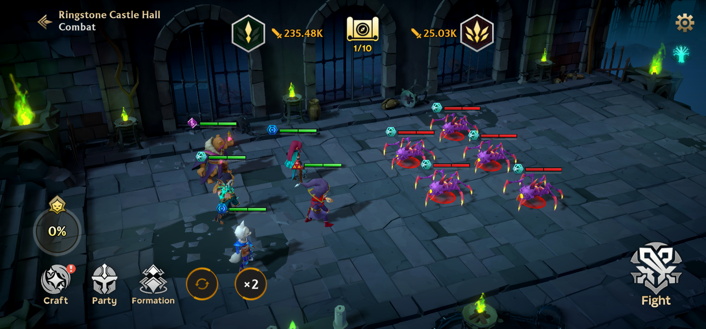
Guild of Guardians is a midcore RPG game where users create teams of 5 guardians to duke it out against monsters, enemies, and other players. In the first 7 to 10 days, the users are expected to play the Adventure mode where they explore the story, learn about the characters, and fight some easy monsters to learn about the game. They need to earn gold to strengthen their equipment and collect souls to level up their heroes.
We had a problem, our D7 retention, the percent of players still continuing to play by the 7th day since they installed, was low. Which means we lost players who we spend lots of money to acquire which reduced the efficiency of our marketing budget.
On top of this, we did not have a dedicated data analyst and user researcher to help us figure out what is happening to guide user research to figure out why it may be happening.
I drove the project starting from these challenges
To these outcome
Action
TLDR
Problems analysed through a mixture of quantitiative and qualitative data analysis
- Poor structure of sessions → it always ended on a negative note
- Lack of recommendations when players get stuck
- Lack of visual goal setting
- Lack of celebration of milestones
How I led the team to fix it
- Make UX and game economy changes to make sure player ends game session on a happy note with anticipation for the next time
- Add a strategy recommendation system that nudges and guides while maintaining player autonomy
- Create visual UI that creates a path and goal setting
- Added moments of celebrations and paired them with in-app purchases to score a double win on retention and monetisation
A quick before and after of the features and screens I worked on throughout this entire process


Being a live product, looking at data is always my first step. D1 retention indicator is a result of if the user has liked the game's core premise, if the game matches the marketing, and other visceral reactions. But D7 retention is an indicator of how much the game has captured the players attention when they are not playing to bring them back and form habits. I was clear from the start from the team - we are optimising for D7 retention and not D1 retention. This requires a more nuanced way of thinking.
A good indicator of D1 retention is session length. Usually playing a long first session is highly indicative of perception fit - the game is offering the exact itch that the marketing said it would scratch. For D7, it's more about seeing what initial habits the players form after their first "wow" moment where they analyse the game more critically beyond the pure fun and see if a game fits their lifestyle through meta features like progression, matchmaking, etc.
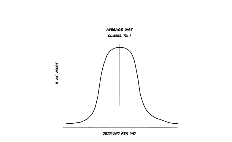
A good metric to track habit formation is sessions per day in the first seven days, where 1 session per day means users are playing the game at least 1 time per day. By writing SQL to query our database in BigQuery, I could derive that the average session per day for new players who downloaded the game in the last 90 days was 1.3. While that sounds great, I trusted my instinct and background in statistics to look into the distribution of this number as averages can often be deceiving.
What was surprising was that we had K shaped behaviour, the players who retained were playing so much that pulled the average up and practically blindsided the team.
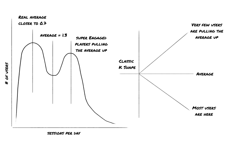
In nerd terms, this is a bimodal distribution and very few players are actually having the "average" experience, and those below the average where definitely not sticking around and retaining, which was a clear indicator why having 1.3 sessions per day still resulted in such poor D7 retention.
Read more about the nitty gritty math
I ran a logistic regression test on D7 retention as the dependent binary variable and sessions per day as the independent continuous variable. Basically, I want to see how much session/day explain D7 retention as these are session per day till the 6th day. Turns out it explained 24% of the variance in a complex model like retention.
The tl;dr of this table is that every 1 unit increase in average sessions/day would increase probability of player retaining to day 7 by 16%. This definitely proves that something about logging in everyday made players retain to D7. Pretty obvious when you say it out aloud but this let me put together a clear case to convince my team's Executive Producer as to why we should prioritise this project and the estimated impact of this project.
| Metric | Coefficient (β) | Odds Ratio (Exp(β)) | T-Statistic | DF LPM R-Squared |
| Intercept (β₀) | 0.003337018482 | N/A | N/A | N/A |
| Independent Var (β₁) | 0.150119959 | 1.161973624 | 98.7768532830634 | 0.2415612125 |
In a world where I had more time, I would have loved to create a multivariable regression model exploring the relationship of D7 retention to session per day, session length (how long did you play each time), activation days (number of unique days played), activation days density (did you play a lot at the start or evenly spread), and game inventory linked to account level i.e. did player progress enough or feel accomplished enough to want to return the next day. Alas, for another day.
The averages are different and it explains correlation. But how do I know if the problem is with session per day and not with overall ability of the game to delight? If that were true, we would see very low engagement in the first session - but the opposite was true with a healthy average 25 minutes first session length. The game had a healthy D1 retention compared to industry benchmarks which means that it was making an impression, just failing to hook players into coming back and forming habits.
Proceeding with this investigation - in Guild of Guardians, you get gold and other resources for playing. And you can use those resources to get powerful heroes, stronger swords, and sturdier shields to defeat bigger monsters. What's the catch? If you don't login in enough times, you can get as much gold as you're supposed to. So you're weaker, the boss is more difficult because your weapons are weaker. This perfectly aligned with the original observation that users were logging in less than once per daily were failing to defeat specific bosses and dungeons.
To make certain that I was chasing the correct lead, I ran a survey to understand the user stories behind the data.
And came in hundreds of responses

Insight 1
There was a question about when in the day do users play the game. The responses overwhelmingly confirmed this game was "unstructured downtime" entertainment
- "When I am picking up my child and waiting in the car"
- "When I'm on the toilet"
- "When I'm in my commute"
This explained the average sessions per day being closer to 1.
Insight 2
Some of the quotes from the survey about "Do you feel the game's timers fit in your day to day life" were quite revealing
- "I feel the game punishes me for having a job, I usually play for an after work but this game punishes me for not playing 30 dedicated minutes twice or thrice in a day"
- "I spend 20-40 minutes to get to the good stuff and then just as I get to the juicy part the game tells me that I am out of energy"
- "I use my lunch break to do all the boring quest stuff so I can actually play the fun parts of the game later in the evening"
Our game's energy system was practically interrupting users from getting into the flow state just as they were about to start enjoying their session.
Insight 3
A few responses to the question "do you think about Guild of Guardians when you are not playing" revealed some key insights.
- "I usually forget about the game till the notification reminds me that I have energy"
- "I got burned a few times by trying to time so now I just put it aside till I have energy and get the notification"
- "I want to play as soon as my energy is full but I can't since I'm at work which raises my anxiety about my progress"
21% of the survey answers outright mentioned that the game's timers did not line up with their schedules.
These were all retained, active players. I imagined the experience felt worse to new players.
The mismatch in the energy system and user lifestyle was creating negative feelings, and driving anticaption from loss rather than positive anticipation from expectation.
All of these anecdotes higlighted that the original system did not take the user into consideration and was designed in a way to maximise vanity metrics like sessions per day and number of logins. Without considering the user, it not only failed but was actively harmful to important business goals like long term retention.
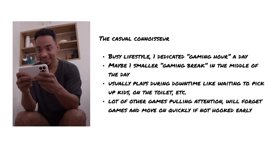
This exercise helped me craft a clear persona that represented the data and the feelings - The Casual Connoisseur. They are characterised by someone who spends thousand of hours in a game, but will play casually at the start as a trial it before commiting.
The hypothesis
- The average user will play more if the game progression fit their lifestyle needs
- The game will hook users for the long term if we shift from negative feelings of loss aversion to positive anticipation for the next session
In the original flow, users had to come back to take an action and be rewarded. This did not generate any anticipation excitement at the end of your previous session for you to not forget this game and want to come back after the first few times.
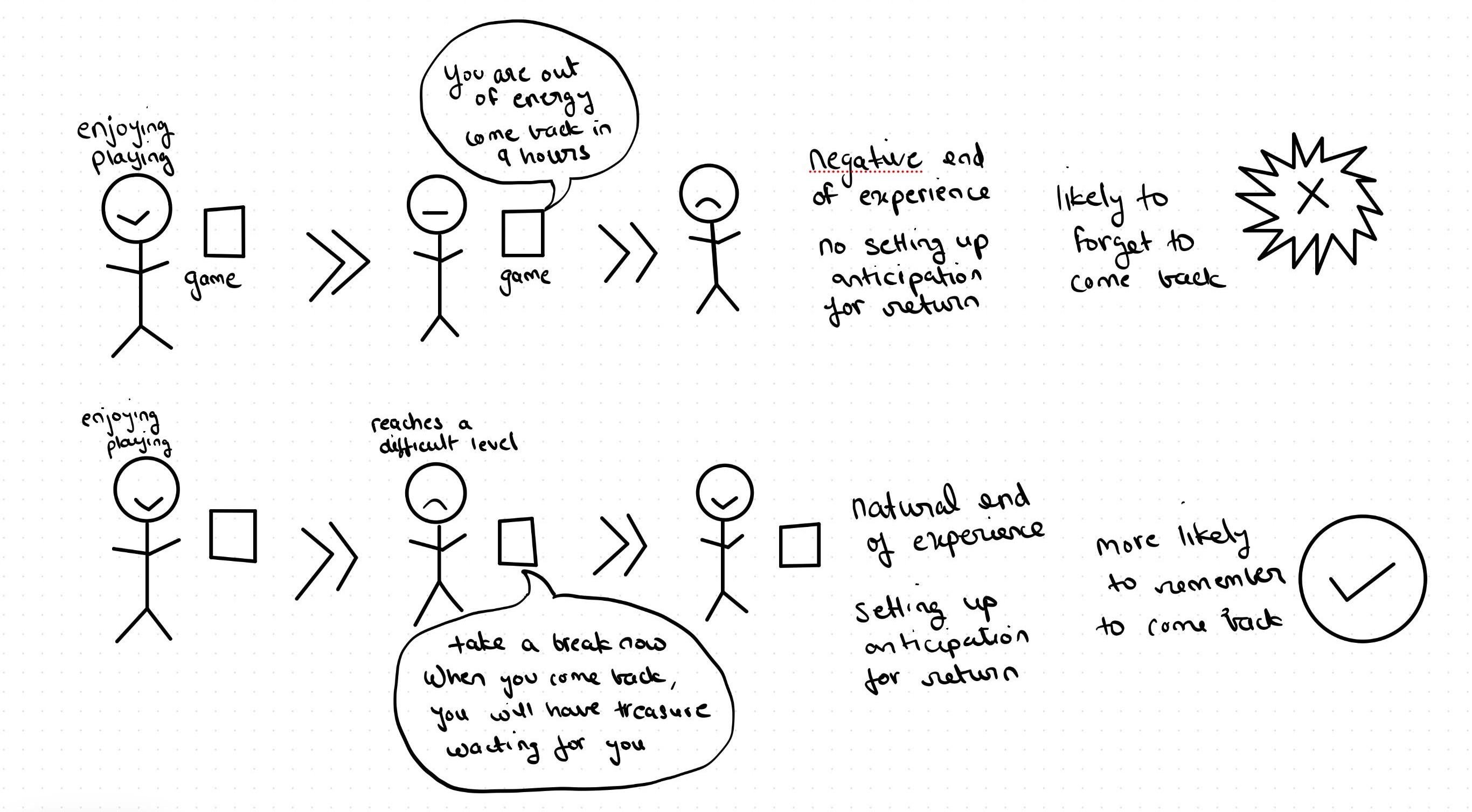
Additionally, it was important to end a game session on a high note and make the player look forward to playing the next time as opposed to making them stop playing and forcing them away. So I redesigned the game loop and subsequently the user flow to start session on a happy note and end sessions on moments on anticipation for future rewards.
The old UI created feelings of punishment through it's presentation and messaging, it told you to stop playing as soon as things got interesting.
After proposing this analysis and hypothesis, the initial ideas involved a daily login calendar which is industry standard. Instead of going straight to designing an MVP, I asked players via a Discord thread on their thoughts about login calendars in other games.
- "I usually collect rewards on autopilot and forget about them"
- "They are annoying and bombard me as soon as I open the game"
- "They're pretty good but I don't open the game because of a daily reward"
- "It's a bonus I guess"
It was clear that while this type of a feature contributes to long term user retention, it does not drive it. It was clear that changes had to be made to the core progression and reward system to move the needle sizeably.
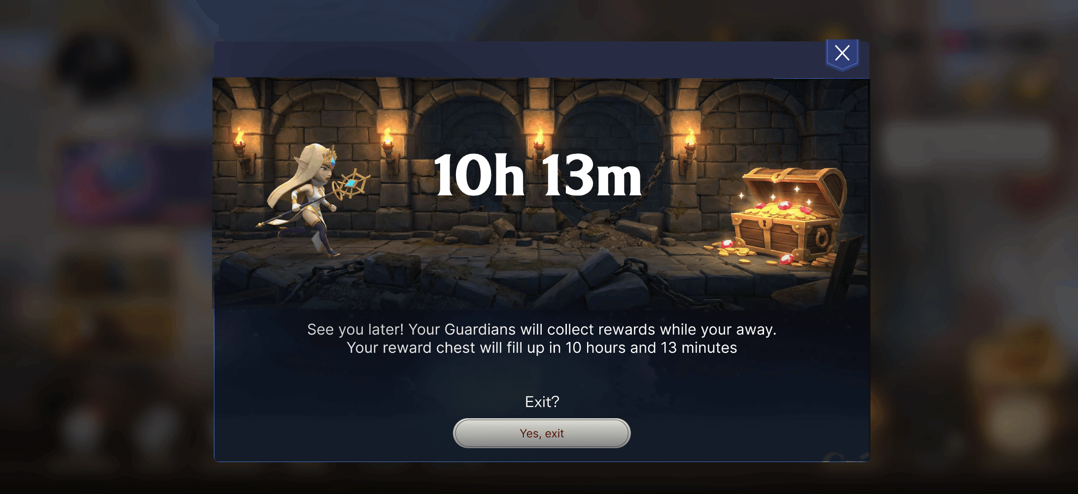
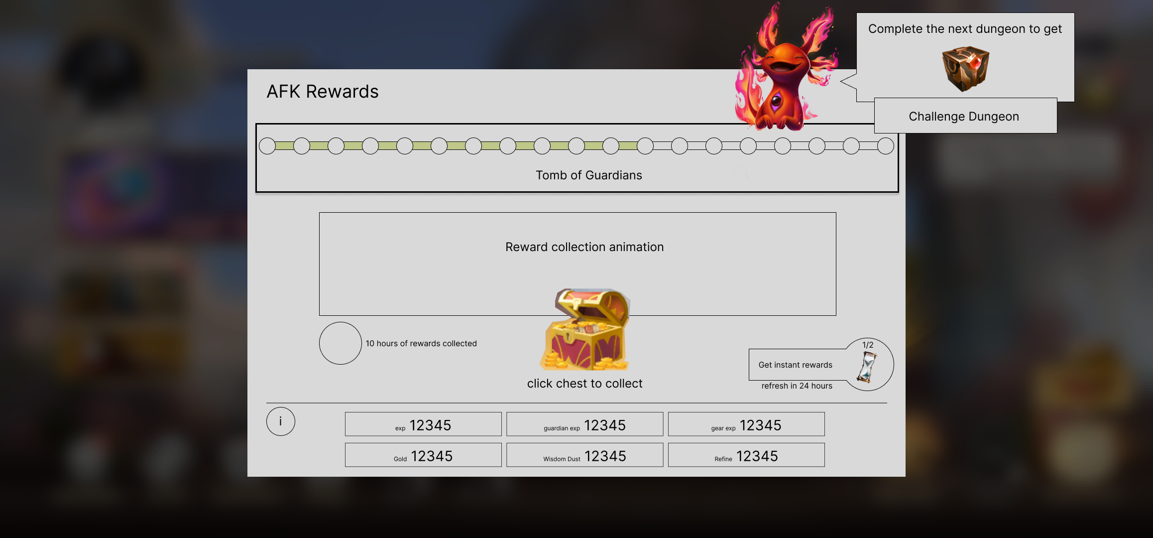
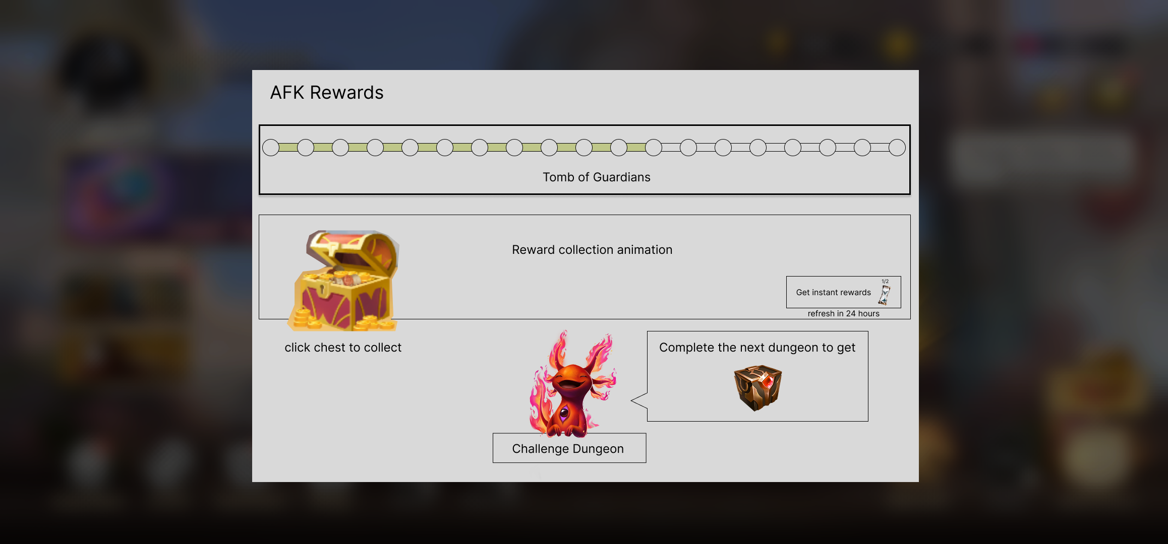
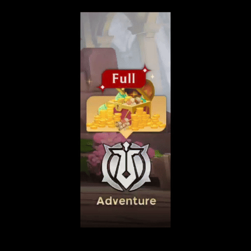
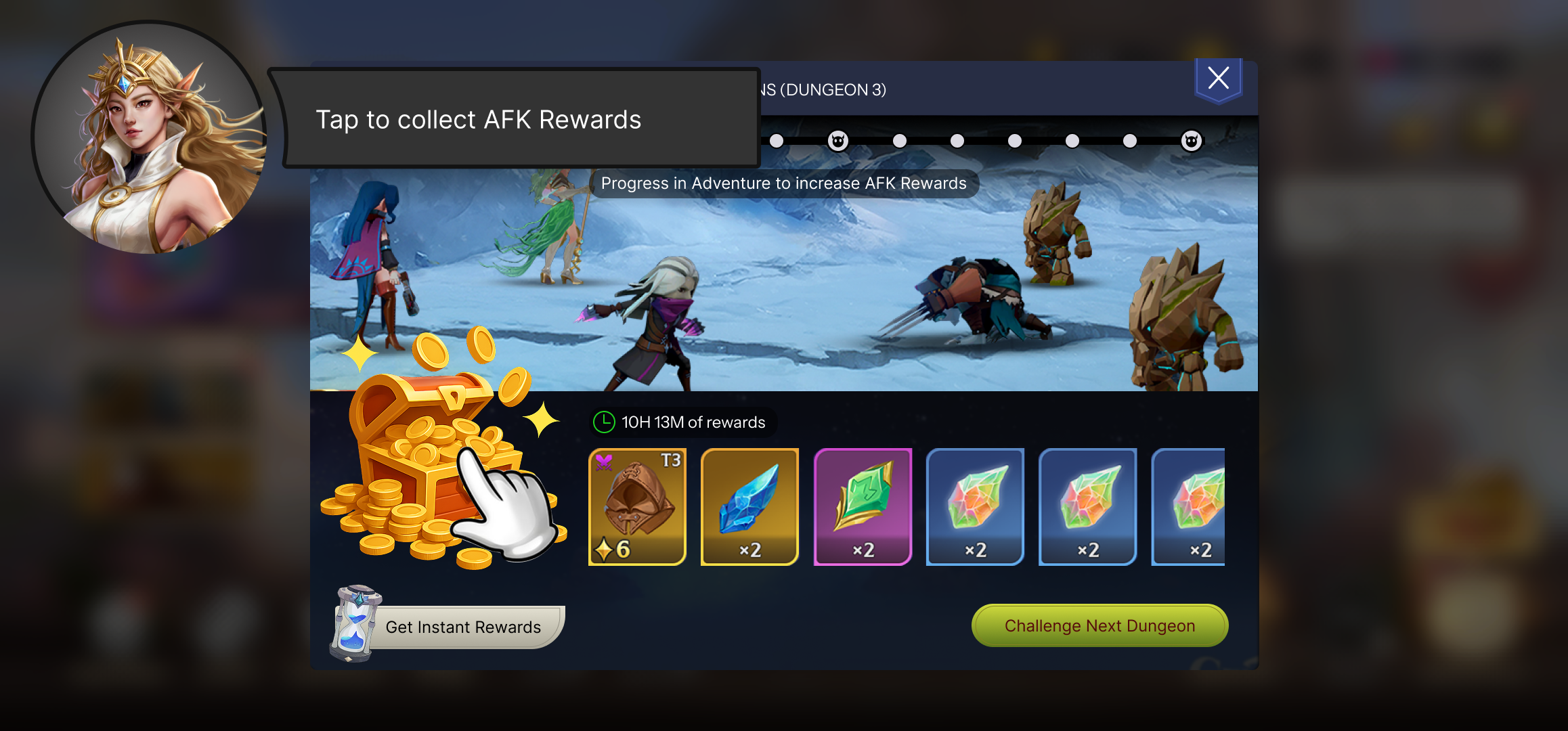
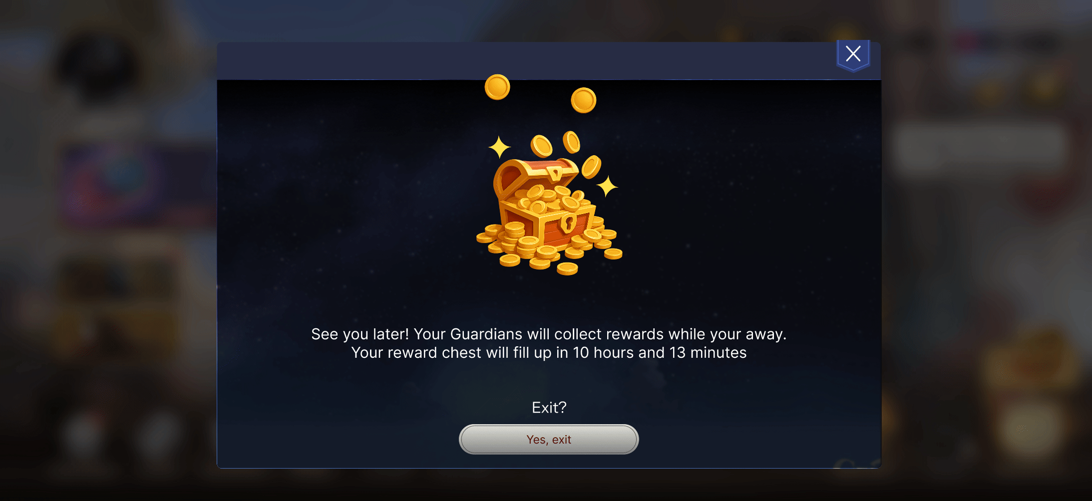
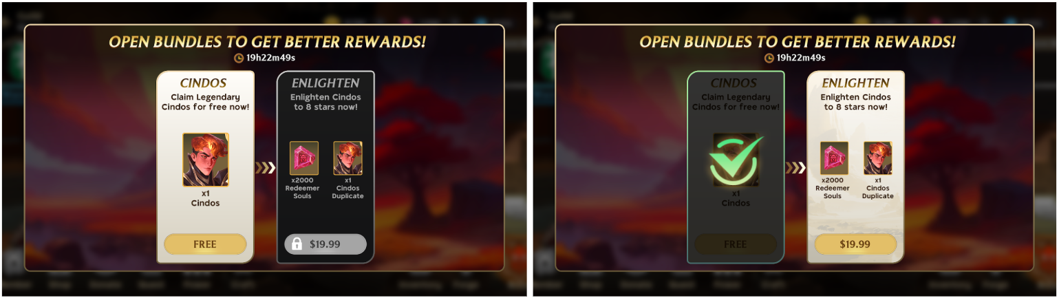
My proposal to the team was to reposition the current energy system into an AFK (away from keyboard) reward system that collects resources while the user is away from the game. This means that when they are ready to leave the game, we can seed the anticipation by telling users that they will have rewards waiting for them to turn negative loss aversion into positive anticipation. And when they come back, the new session will begin with a moment of delight. After a workshop sessions to let everyone have input and provide feedback and a technical review, we aligned on the specific version of our feature.
After the team agreed on the new user flow and the end goal of this design, I had to create 3 new UI components - A button on the main menu for this new feature, a screen for the new feature, and the tutorial for the new feature.
I set out to mock up the new user flow with a combinations of existing and new screens in Figma to be able to map out how much new UI work was needed.
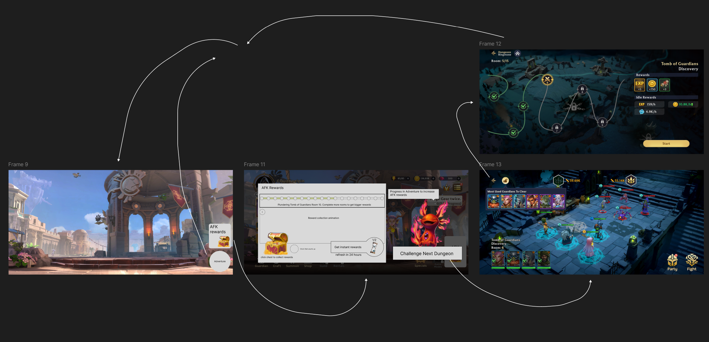
My process starts with a brain dump and creating 5-6 quick sketches of a layout. Here are 2 concepts I stored from the general set of throwaway layouts I create.
After brainstorming with the another UX designer and the UI Artist for external perspective, I finalised one layout focused on delivering rewards, celebrating receiving rewards, and setting up goals for the users. I proceeded to make a high fidelity mockup of that version.
The original first mockup that we built in the engine for internal prototyping had a button instead of a chest.
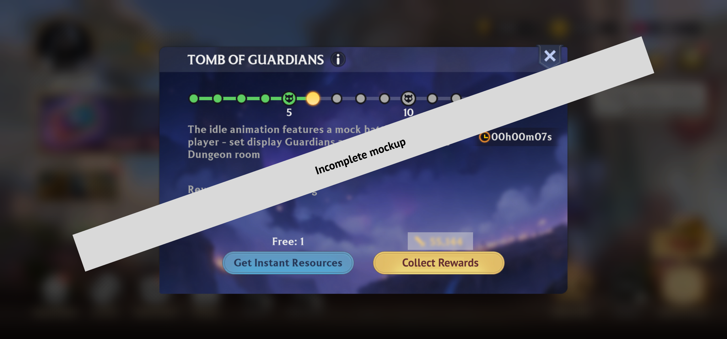
While I expected basic usability with this version - which is that most users could consistently complete the action and collect their rewards - my team's artist made a great remark that this screen was missing feelings of delight and the joy of unlocking many rewards accumulated in time away from the game. The engineer on my team wanted to keep the simple button for clarity and to reduce engineering effort, but after conducting competitive analysis we found out that most games in this genres have incredibly high bar of polish and animation for their rewards screen which is usually the "dopamine" factor for these kinds of games.
With buy-in and alignment from engineering after showing them the proof from other games on why we need to focus on a high bar for polish and animation, we built a fully fleshed out component that looked like a treasure chest filling up with rewards over time. All credit for this art and polish goes to our Senior UI Artist who pushed and advocated for creative flair in our UI, and I'm really glad I supported them to get this built against some initial internal hesitation.


I always expected and my instinct was confirmed via playtests that the chest on the screen did not look like a button and did not look clickable, and in early internal testing users were confused on how to actually collect rewards. While the chest managed to delight users, it lost some aspect of standard usability - consistency with the rest of the UI so the users know what is interactable and what to expect.
To re-focus and bring some aspects of this interaction back to usability, I decided a tutorial for the first visit to this screen was the best solution to teach the player that something which does not look like a button is actually a button. During internal testing with external team members, we also found out this lesson had a 100% memorisation rate, that means all of our participants of the playtest could remember the action 24 hours after the tutorial.
I asked the community manager to keep a specific eye on complaints about this issue either via posts or support tickets and closely monitored data to see if players were stuck at this stage. There were no mentions of this particular issue over a 4 week monitoring period so I opted to forego analytical analysis to save time budget for design work.
Users found this feature to be much better aligned to their general lifestyle needs and felt it gave them agency to decide how and when to play the game. Some quotes from my user studies
- "I don't have to think about this game during work, which means I can fully focus on it after work"
- "The new system is far less annoying, I only have to open once a day and maybe twice if I really want rewards for the new events"
- "It's nice to get all my rewards at the start and then just go into playing. Earlier, I did not look forward to using energy for the 15 minutes before I got to start playing what I actually wanted"
- "Thank god y'all removed the arbitrary timer. Now I can consistently play every evening when I'm actually free"
To close off the new game loop that I proposed, I added a quit screen that set goals and anticipation to encourage the user to come back.

I made a very quick animation made in Figma to share the idea within the team. Ending the session on a note of future rewards created a strong reminder to come back and eventually builds habits.
Taking this idea, the artist polished the final UI. I used UI data to find out how many players close the game by pressing the close button in-game that triggers this dialogue vs how many players close the game through the operating system (like you do on iOS), which is much more common for mobile. Suriprisingly, only 12% players closed it using the dialogue. With so few players seeing this screen, I could not justify the ROI of spending lots of effort to develop and implement animations and encourage the artist to stop at static design.

This was the final mocked up user flow in an interactable Figma prototype.
Beyond just the UI and the visual user flow, there was a flaw in the progression design that would lead to an overall poor experience. The progression worked in such a way that players would unlock a weapon to create excitement, but by the time they collected all the gold to acquire that weapon, they would also simultaneously unlock the next sword. This dampened the excitement of the reward they just received in the form of the sword, and every milestone went from being an opportunity to celebrate to a moment of setting a new goal without acknowledgement.
The simplest fix was restructuring the existing progression in such a way that players would get all the gold required to unlock a sword over time, and they would unlock the new sword more or less around the time they got all the required gold. This created a satisfying moment upon return where players would get a sword after progressing through the campaign and immediately get to use it to kill stronger enemies. This was a pretty invisible and not related to the UI - but a highly impactful and under the hood change that made a world of difference. I need to be extra careful with this particular change as I did not want to give the player too many rewards and cannibalise monetisation.

After implementing this feature, I found out through analysing further data as a retroanalysis that players would get stuck at specific dungeons in the campaign mode and they would quit the game after trying a few more times. This was a highly correlated factor to low D7 retention.
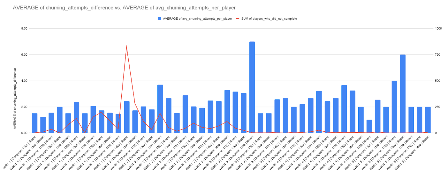
After analysing the data of what heroes they were using to fight, it turned out they were using weaker strategic teams. I went around the office and asked employees who did not work on Guild of Guardians but played it regularly for their unbiased feedback on this specific issue. Many of them replied with not knowing why an enemy was powerful to then be able to infer what is the best team of heroes to use against them and only being able to proceed after getting that information from other advanced players.
I wrote SQL queries to pull data of user behaviour from the last 60 days to validate this anecdotal data with statistically significant data.
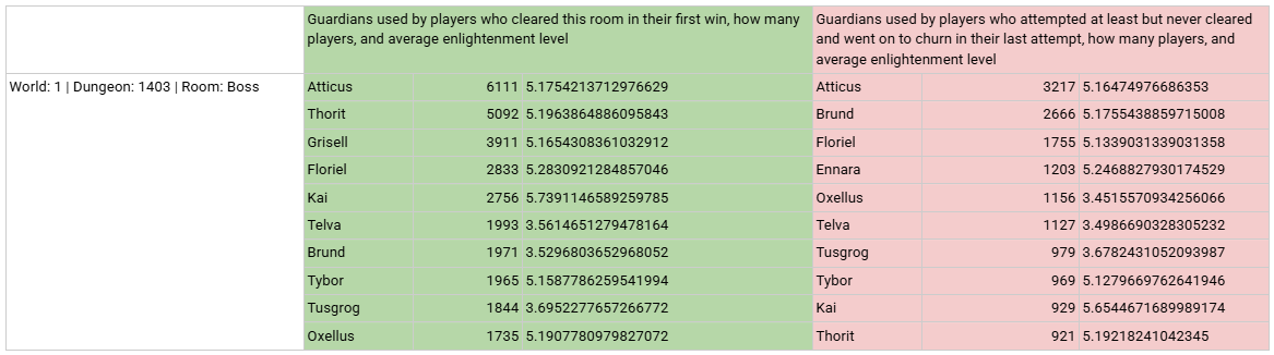
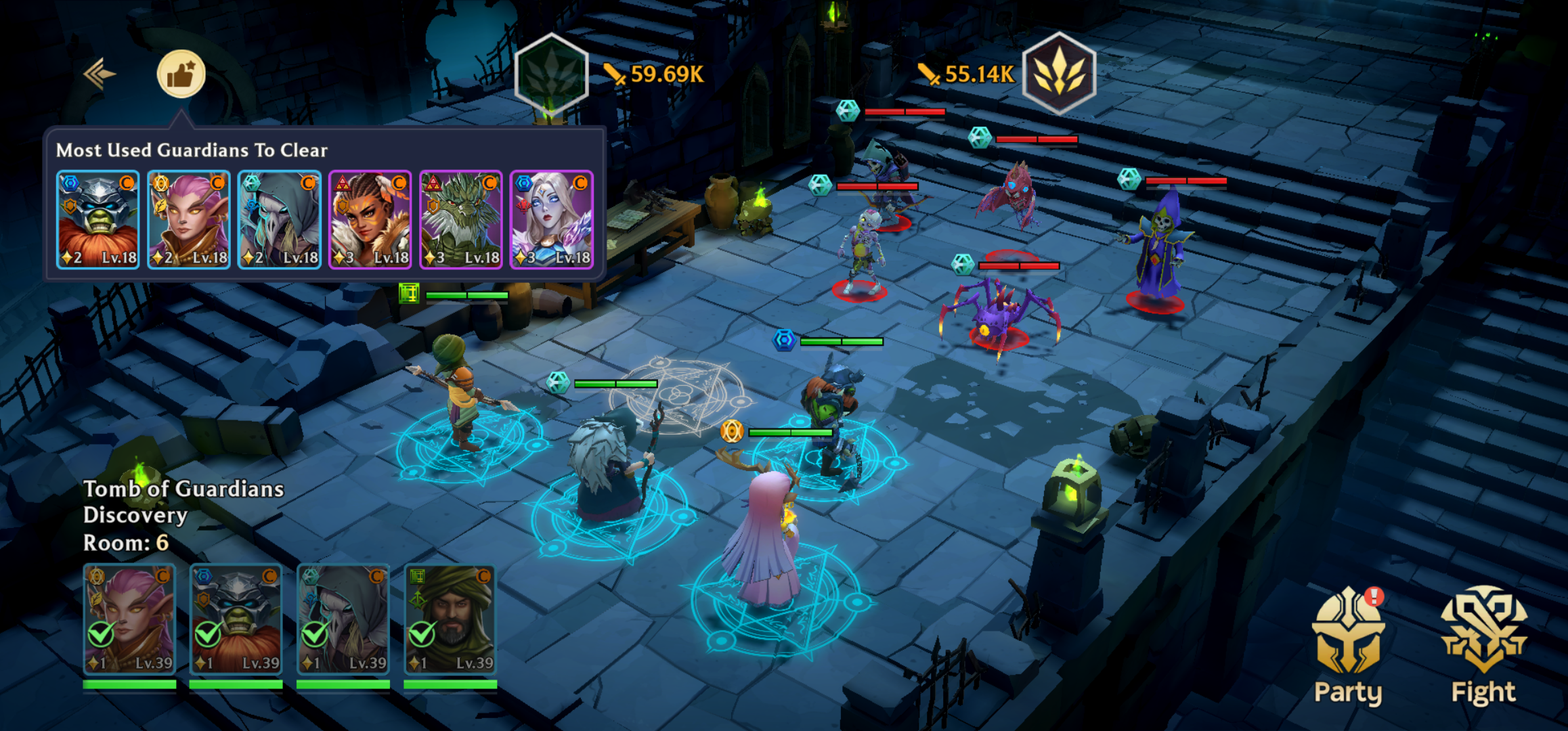
After a quick workshop with my team we discovered that the easiest and simplest solution we arrived to was adding a reccomendation system using server wide hero usage data.
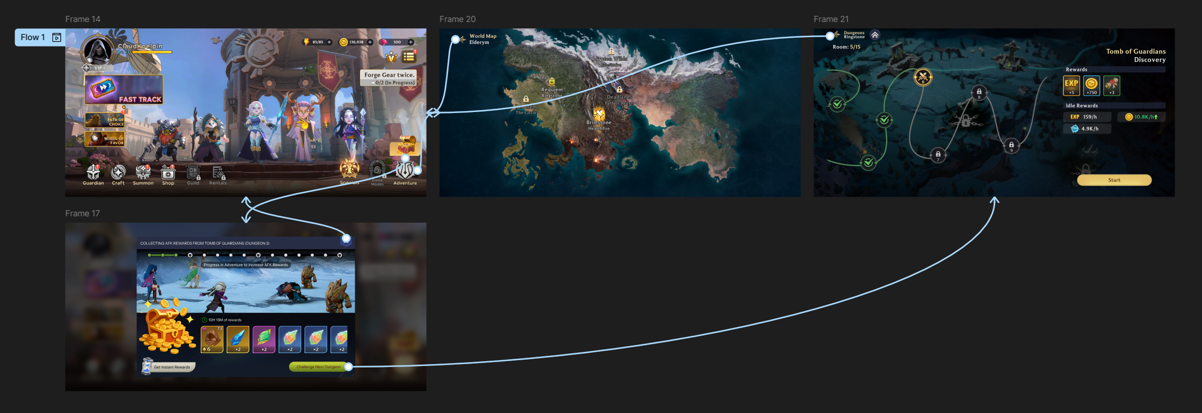
Here is how the experience looked like previously and then after the new feature was added


This feature was tricky to analyse because the feature was not clickable to the user, they could only read this information. So I had no way of knowing if it was helping or not. A proxy data point I used was to observe how many users used teams that were different from the recommendations in their first attempt and then used the recommended team in the next attempt to then clear the dungeon. The success of this funnel was increasing for multiple weeks until it settled in the high 55% (basically 55% of the players changed their team to the recommended team in their 2nd attempt to go on to complete the dungeon), so I could infer that users got actionable information from this feature to be able to positively impact their ability to win.
Through qualitative insights from talking to players informally via Discord and analysing the messages using AI tools, I also found out that players quit after losing once or twice because whenever they lost in a dungeon, they had to begin from the start. This design was an ill fit for a mobile game which have easier and smoother progression. I collaborated directly with the game designer to add a new dungeon progression system that used checkpoints so players can instantly reattempt the dungeon that they lost at instead of having to begin from the start. This was a simply and purely UX change as no balancing or remaking of content was involved.
Here is how the experience looked like previously and then after the new feature was added

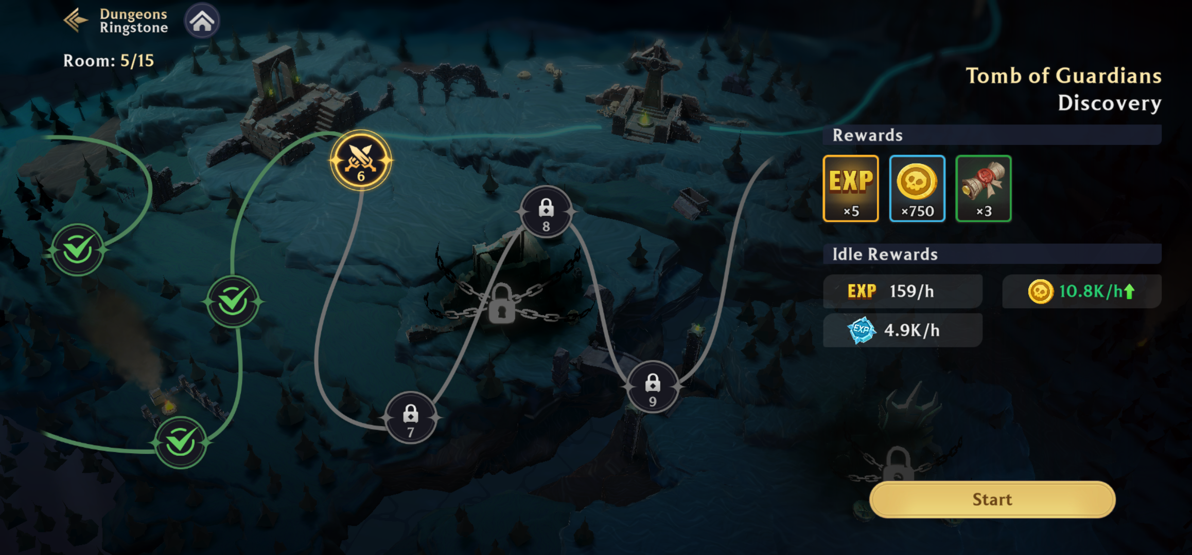
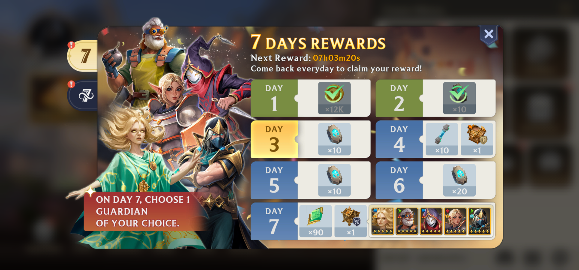
The next piece was to add a goal at the end of the 7 days to build anticipation and increase the odds of retaining to day 7.
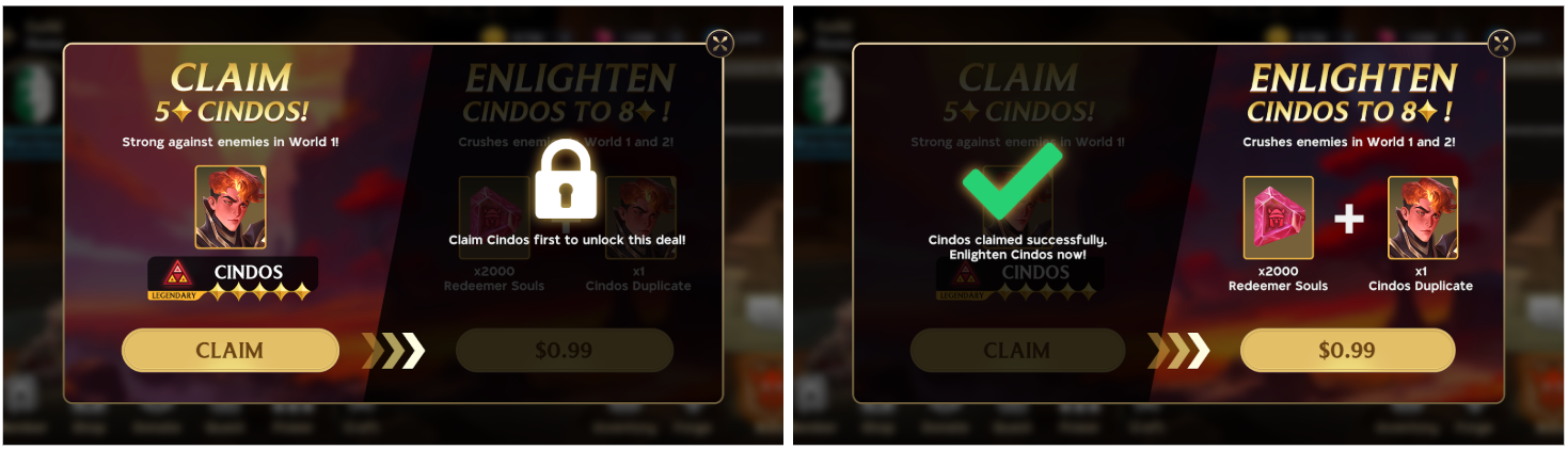
Since our game had a plethora of legendary heroes that players wanted and would open gacha for and hope to get, I created a 7 day reward that let you pick 1 legendary guardian. This let players experience choice and autonomy at the end of long commitment. The hypothesis was that delayed gratification would make players stay longer than day 7 in anticipation of further dopamine rushes. The UI design for this feature was specifically chosen to look like a countdown calendar so the players had something to look forward to not only the next day but also a bumper reward at the end of the week.
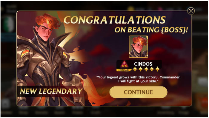
One of the final changes that I added under this block of work was a moment of delight at getting the players first legendary hero. Originally players had to wait to get one from gacha or the newly implemented day 7 calendar rewards, but I added an explicit scripted moment to get the first legendary hero after defeating the first boss to make it feel celebratory and achieved by playing the game.
This decision was not informed by pre-prepared data as it is hard to analyse something that does not exist, so we A/B tested this implementation to see the impact. The players who got to experience this showed 38% higher likelihood of retaining to D7 than players who did not, which was made obvious by seeing the usage data of that legendary hero to clear out the subsequent dungeons.
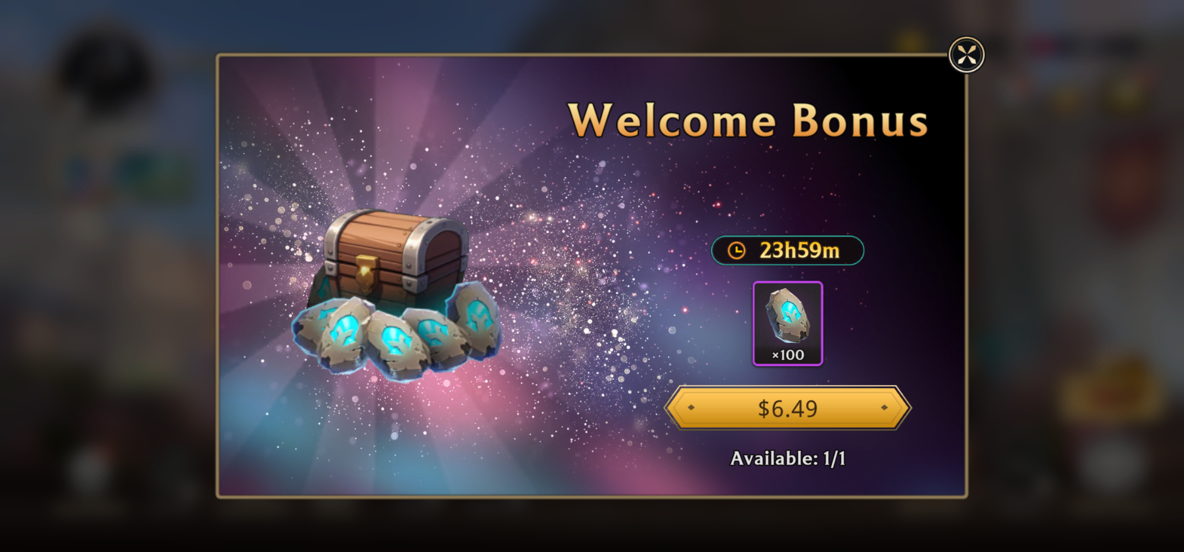
After the success of this moment of delight, I added an introductory offer with clear messaging to be paired with the delight for players who wished to fast track their progress in the campaign. Compared to our old, outdated introductory offer, it performed 92% better against new players and increased the odds of a purchase making player to retain to day 7 by 65% higher than a player who did not purchase this offer. Basically, it doubled the number of purchases and reduced buyer's regret so users who purchsed continued to play.

This block will go through the iterations. I designed the original user flow for receving the legendary hero and creating a moment of delight. I pushed the design further into mid-high fidelity just by myself to refine before I got help from a senior UI artist to polish it into the final stage.
Stage 1 - low fidelity wireframes focusing on the user flow, dialogue trigger, messaging, value proposition, and clear design intent to get the initiative started
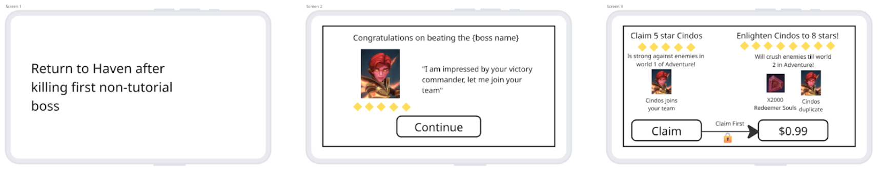
With feedback from some other team members outside our team, everyone on my team eventually aligned that we want to reduce these two screens into one because players were falling into a habit of closing popups and we had to make a shorter, snappier interaction.
Stage 2 - Iteration 2 polished by the UI artist based on my guidelines and direction. I rejected this in an internal review as the moment of delight felt more like a sales offer from the get go than an additional benefit to a celebration. It included offer like wording like "Free" and an immediate follow up offer, making the free part look like a clear sales hook. I wanted to push for more subtelty.
Stage 3 - Iteration 3 polished by the UI artist based on my feedback from Stage 2. We A/B tested stage 3 with 10% of our incoming new players as a 5% and 5% split, and it performed better than the old offer. But I pushed the team to improve it from the stage 3 version as it not have any grounding in narrative context which was something we had feedback from late game players in our Discord who wished for more lore and context around why certain features exist. After all, they don't want to play a video game that could have just been a spreadsheet. So I really wanted to get started with lacing all in-game events with some narrative explanation to get our new players used to the fact that this is a rich and varied world.
We A/B tested the Stage 3 vs the final version in a similar setup and the final version outperformed this one by 4% on claiming the free hero and by over 10% on purchasing the offer!
Result
We saw our D7 retention increase by nearly 25% after all features were shipped.
If you remember the session per day distribution that I analysed at the start of this project, it started looking a normal distribution. The "average" fell down to 1.1, but more users were playing at least once per day and overall less users churned from the game and improved D7 retention.
In nerd terms - the bimodal distribution eventually regressed to a normal distribution, and fewer overall players churned after solving user pain points. What this means was that we no longer had a k-shaped behaviour where the most engaged players were playing so much that it pulled the average up and gave us the wrong impression of the game.
If you remember the initial data point that I looked at the beginning, the inference of the logistic regression model was that there is a 16% higher likelihood of users engaging if their sessions per day increased by 1 unit. Even though the average came down, within a sample, the number of total users experiencing higher sessions per day increase. This resulted in total net volume increase of retained users to day 7, and effectively increased day 7 retention.
While it is difficult to attribute the results to any single change, we continuously monitored data and collected qualitative feedback through community managers engaging with the player base to gauge the estimated weighted impact of individual changes. I built dashboards to track main health metrics such as average sessions per day, D7 retention, average session length, etc.
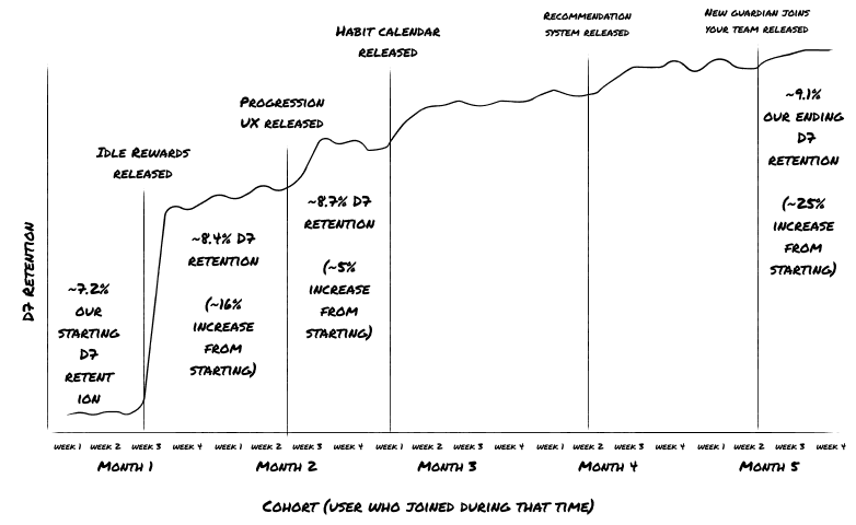
Over the course of development we collectively found out, unsurpisingly, that impact on D7 retention followed an 80/20 principle i.e major impact came from the earliest, biggest changes (such as building up the away from keyboard idle rewards and readjusting some of the milestones and rewards) and the marginal gains of impact from later, smaller changes became smaller and smaller.
At that point, it made sense for me to propose to our Executive Producer to dissolve the "D7 Retention" strike team and reallocate people to other features in development.
Additionally, using free content to grab the players attention followed by a surgically placed in-app offer with very clear messaging and value proposition increased our D7 LTV (money made from a player within their first 7 days from creating an account) by over 12%! Even though this was not our goal, this was a double win for the team.
Learning
This was a major block of work that took multiple months and was shipped over multiple releases. The discovery phase started by understanding that what players are lacking is beyond the screen, it's a mismatch of the game's user experience and their habits and lifestyle. Once we understood that, we knew we had to make critical changes to features besides just updating the UI.
But with hypothesis and insights backed by data about player behaviour, we could confidently commit to this long endeavour to deliver value with constant iteration and see each addition having an impact on our business goals. Confidence in vision is key to keep the team motivated when the development period is long and uncertain.
Usually I rely on a team of data analysts but on a small, under-resourced team I had to basically also be the lead data analyst on this feature. This block of work deeply tested my ability to source data and craft hypothesis to choose the correct solutions and priorities for them. If you want to see my full in-depth analysis that I did at the start of the feature to convince, align, and motivate the team as to why these problems are important, you can read the lengthy report here - LINK. This Google Doc may take you upto 15 minutes to read.
Josiah Wallace, Senior Game Design Manager
"Data driven design is now a keystone in modern game development and there are few others like Bramha who combine the UX and Game Design know-how with the Data Analysis process & procedure as well as he does. The decisions, features, and projects he stands behind always produce measurable results, drive revenue growth, and increase player retention."

Daniel Paez, Executive Producer
"Bramha was always able to breakdown each design decision into its core target audiences and their motivations, helping cut through the franticness and rash decision-making and driving towards elegant, effective solutions."